Food safety training and certification made clearer
ServSafe strengthens learning flows, usability, and intuitive training experiences for teams and learners across the food service industry.
Situation
ServSafe needed to modernize its legacy digital training ecosystem to fix fragmented educational content and disjointed workflows. The existing platform suffered from high user drop-off rates as hospitality workers struggled to navigate mandatory regulatory training.
Task
As the Lead Product Designer, my mandate was to overhaul the end-to-end training journey and streamline compliance tracking. I owned the strategic redesign of the course delivery interfaces, progress dashboards, and core certification testing workflows.
Action
I conducted behavioral analysis to isolate friction points, mapped a unified user journey, and engineered a modular design system. This structured UI framework simplified dense compliance content into highly intuitive, digestible learning tracks.
Result
The redesigned platform drastically reduced user drop-off rates and significantly accelerated course completion speeds. The streamlined interface optimized workforce compliance velocity, enabling hospitality professionals to secure required certifications much faster.
Discovery
A series of research activities were conducted to understand user expectations around food safety training and certification workflows.
System audit
ServSafe’s training and certification products were examined to understand their structure, content flow, and overall user experience. This review provided clarity on how the existing system supports learners and administrators, and highlighted opportunities to improve usability, navigation, and task completion.
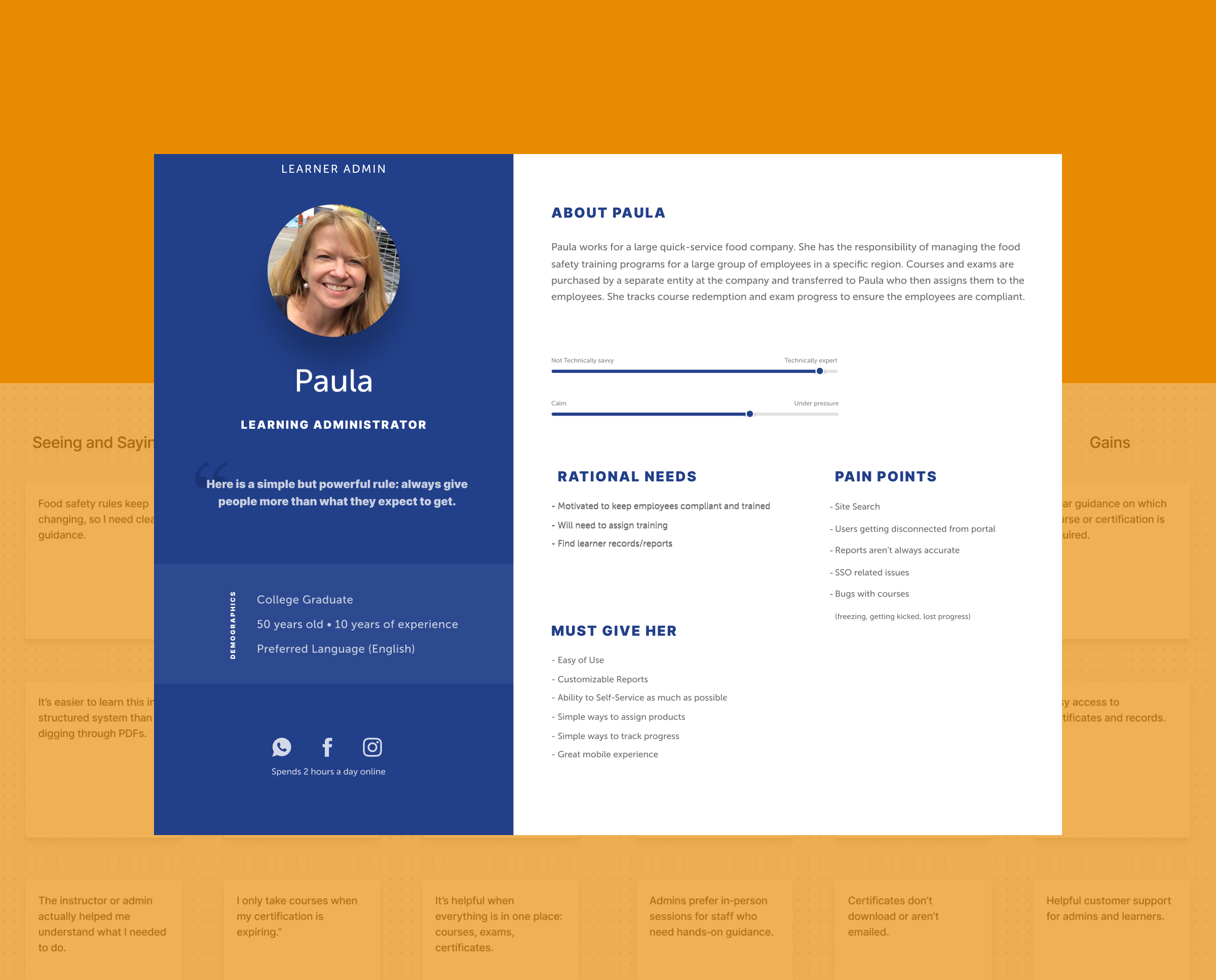
Workshops
Empathy mapping workshops were done to comprehend our users better. The workshops aided in creating personas that reflect distinct qualities and motivations, revealing areas for improvement and leading to a better user experience.
Information architecture
The core navigation, content hierarchy, and user flows were mapped to ensure the experience remained intuitive, predictable, and aligned with established user mental models.
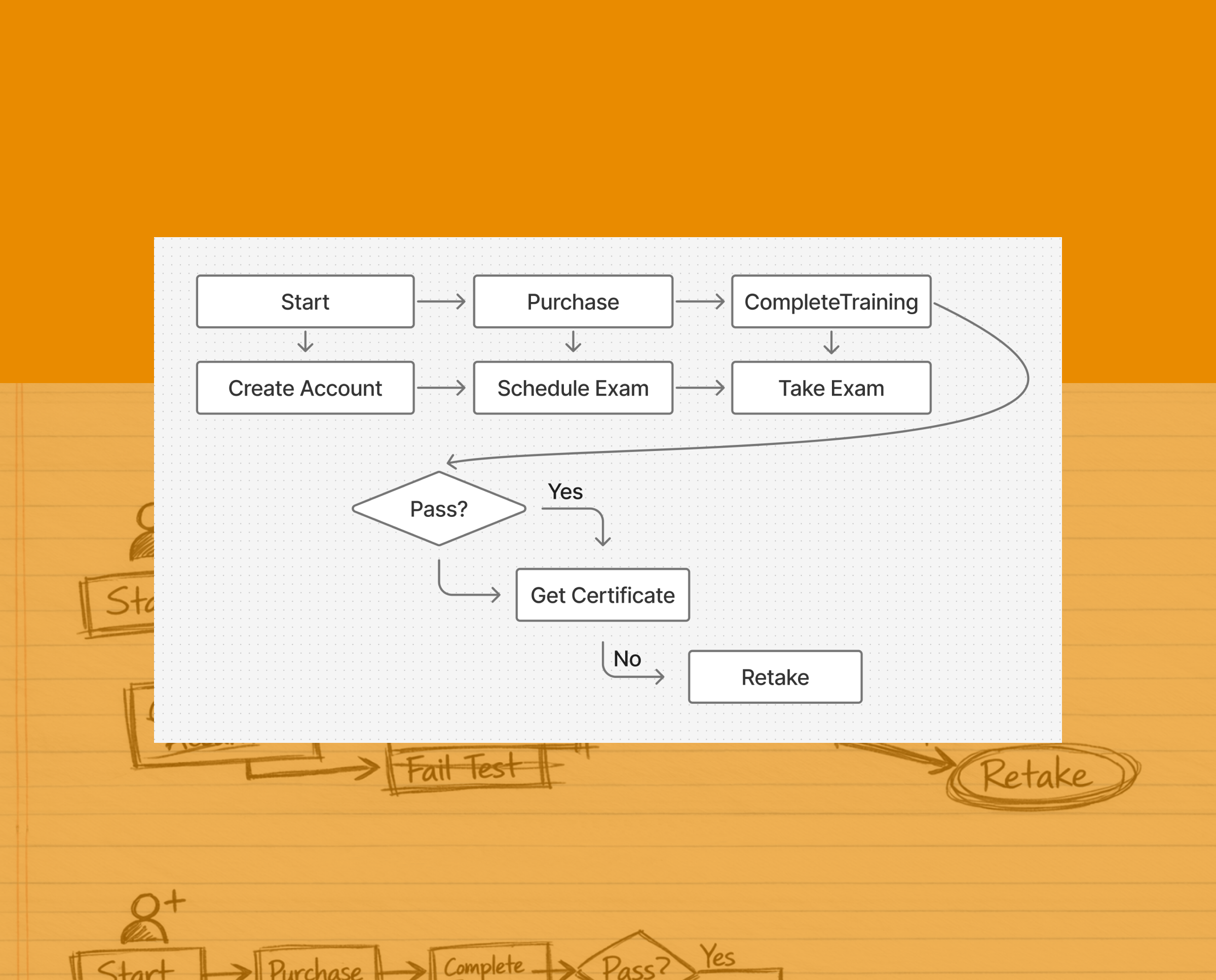
User flows
User flows mapped the key decision paths learners take, clarifying steps, branches, and system responses so the team could validate logic early and remove friction.
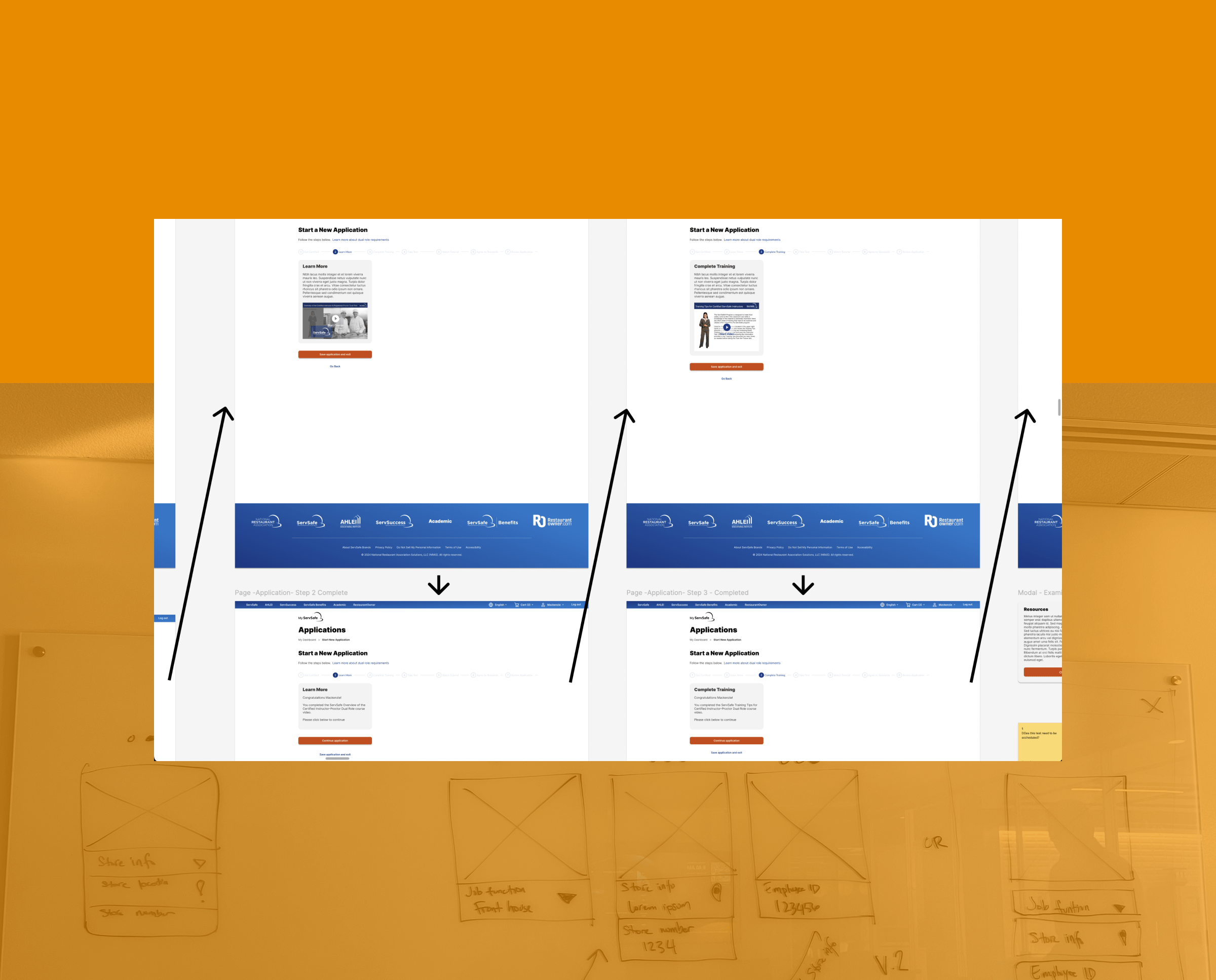
Wireframe flows
Wireframe flows translated those paths into screen‑level structure, showing layout, hierarchy, and interactions across the journey before moving into high‑fidelity design.
Visual design
A scalable design system was developed to unify typography, color, spacing, and component patterns across mobile and web, ensuring consistency and predictability throughout the product experience.
UI Exploration
Early UI exploration established the initial visual language for the product. With minimal existing brand styles and no design system in place, these explorations defined the core patterns, components, and structural principles that later evolved into a cohesive, scalable system. This groundwork ensured consistency, clarity, and alignment across all subsequent design work.
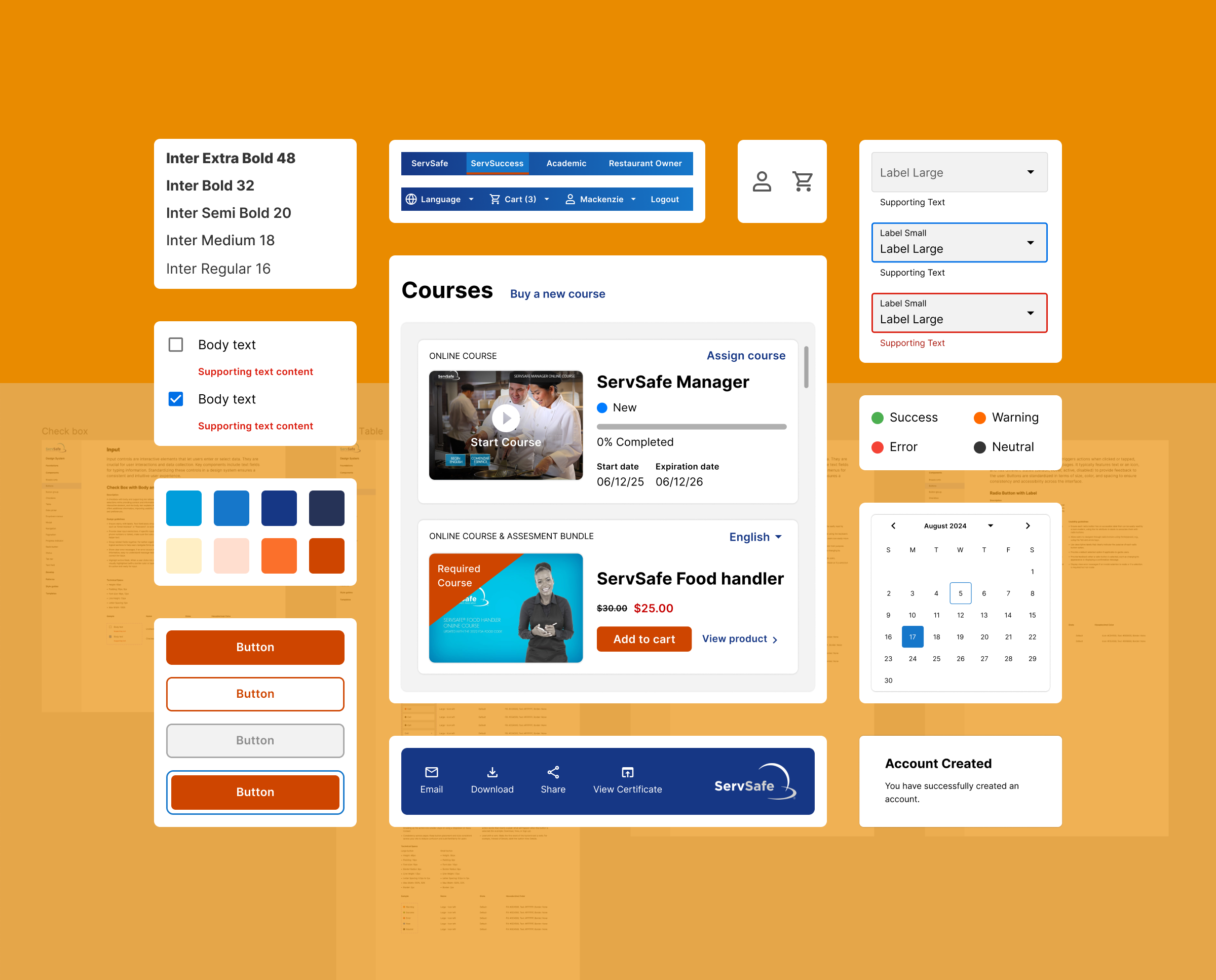
Design system
This UI framework streamlined the team’s workflow by offering ready‑made components and reinforcing established interface standards. It also supported smoother long‑term maintenance and updates while preserving the overall stability and consistency of the site.
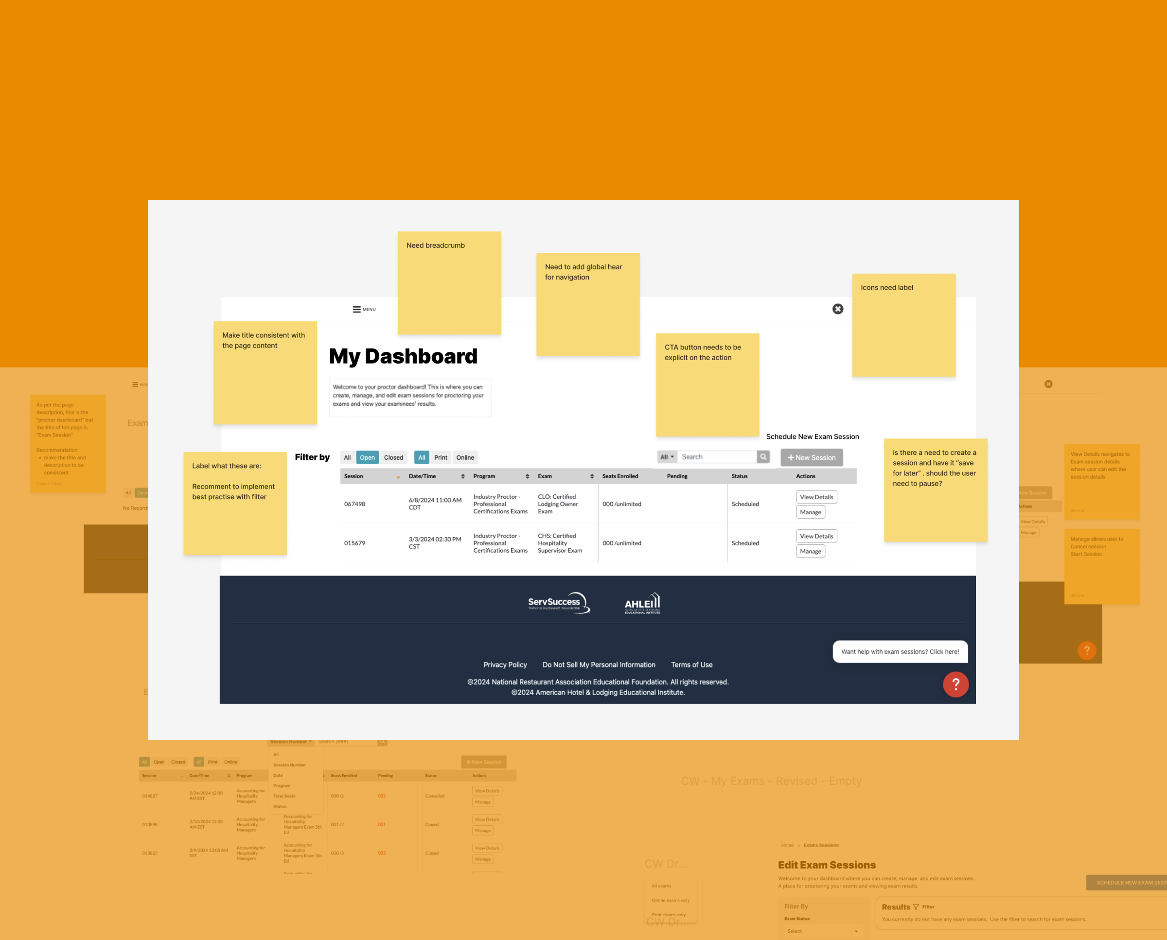
Testing
The interactive flow was reviewed to assess clarity, ease of navigation, and overall usability. This evaluation surfaced opportunities to strengthen the experience and better align it with user expectations.
Prototyping
High‑fidelity screens were organized into an interactive flow that demonstrated the intended behaviors and end‑to‑end journey. This step made it possible to validate structure and interaction logic before moving into refinement.
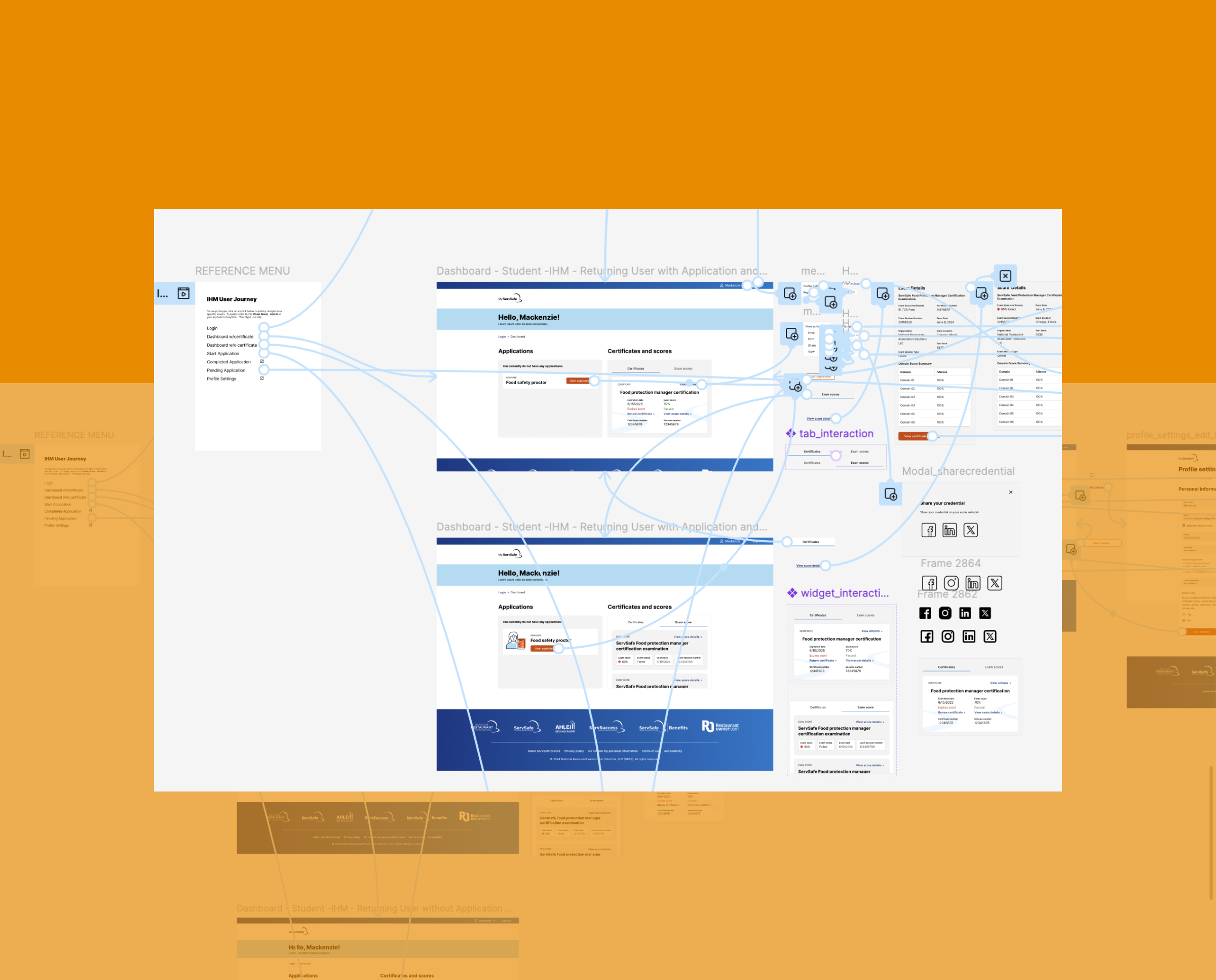
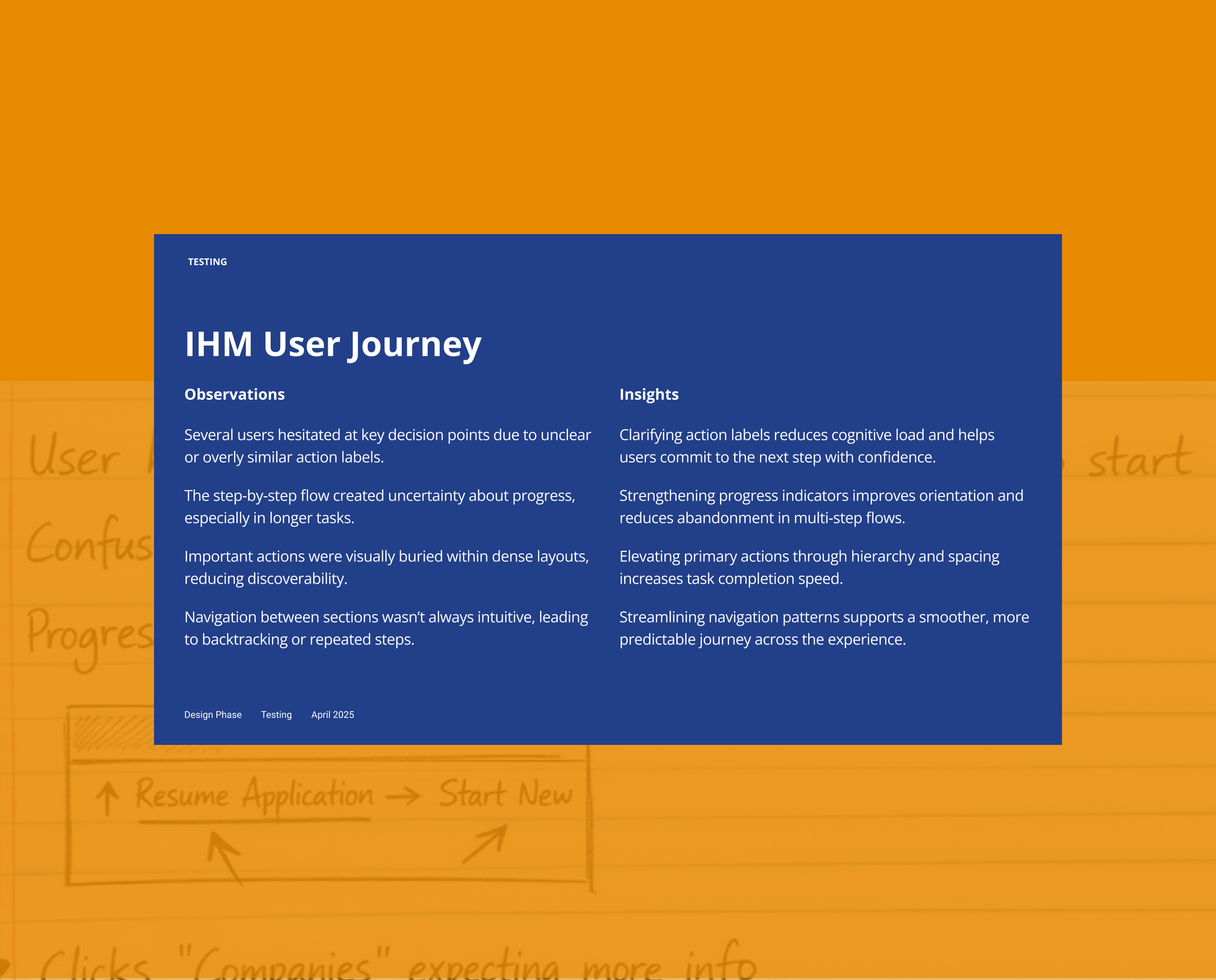
Observations and insights
Testing surfaced several opportunities to improve clarity, reduce friction, and strengthen the overall flow. These insights guided a focused round of refinements to ensure the experience felt intuitive, consistent, and aligned with user expectations.
Product shipped
A refined, intuitive training experience built on clearer workflows, consistent design, and streamlined paths that help learners complete courses and manage certifications with confidence.
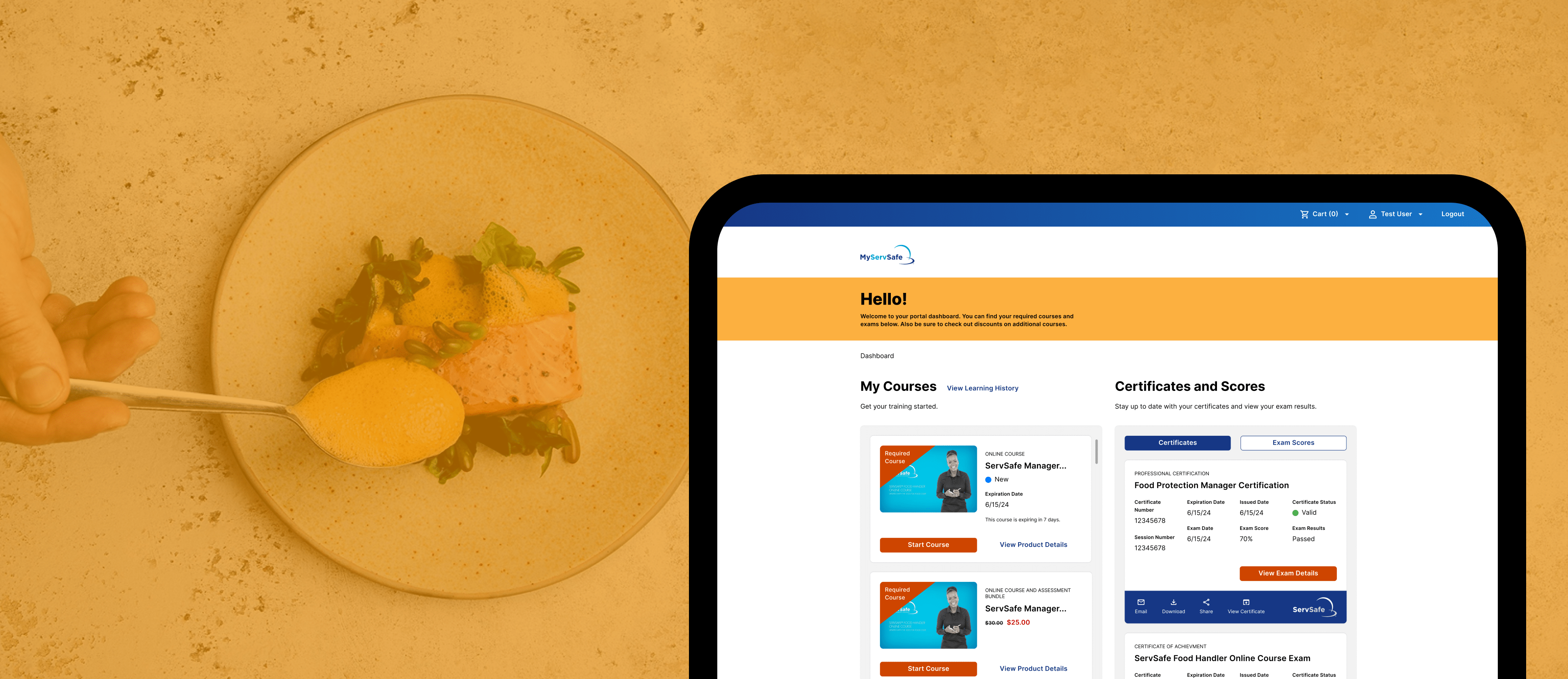
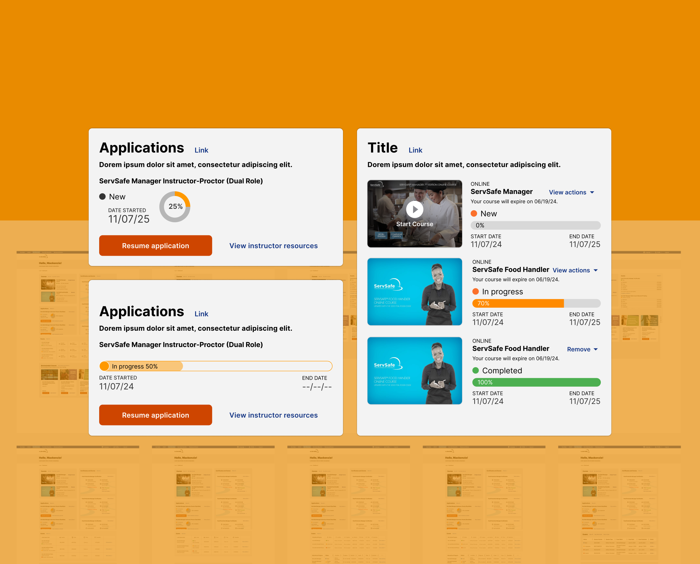
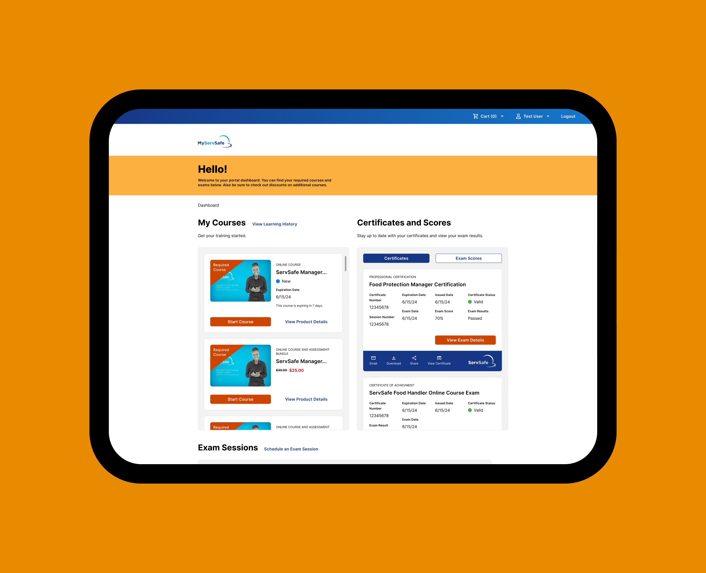
Dashboard
The dashboard brings courses, certifications, and exam activity into one clear view. Learners can quickly see what’s required, track progress, and take action without navigating multiple pages.
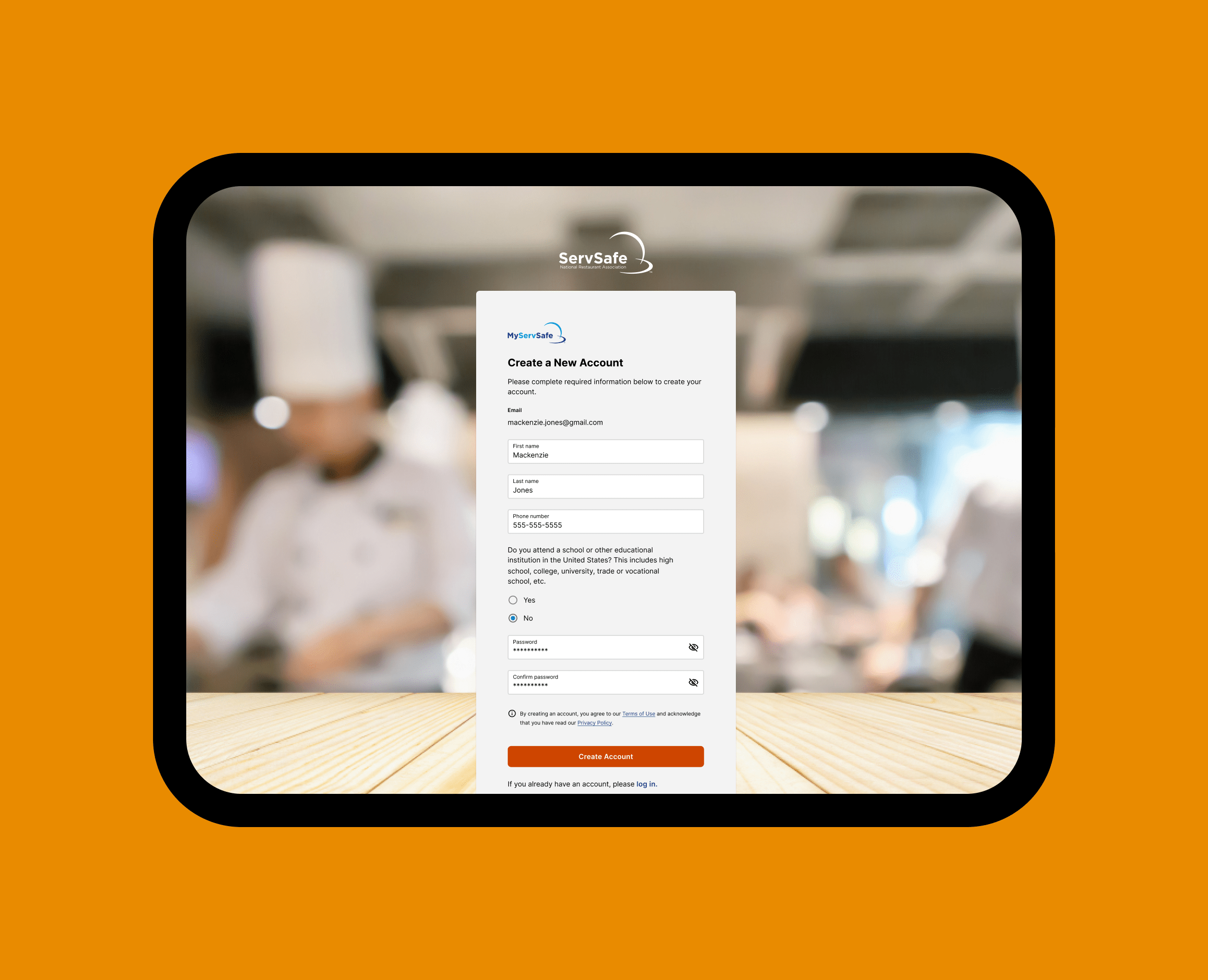
Login
The login flow provides a straightforward entry point into the ServSafe training platform, with clear fields, simple choices, and predictable steps that help users create an account quickly and confidently.
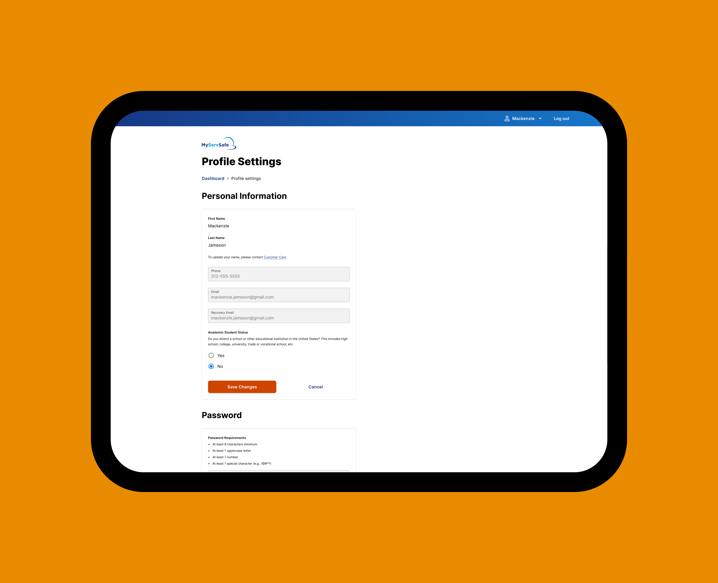
Profile settings
A structured settings interface allows learners to manage key account details with clarity and consistency. Standardized components and clear validation patterns ensure secure updates and reduce support overhead.
Next project

Nutrilucent
Wellness retailer specializing in nutritional supplements and cosmetic products, grounded in research and product systems that convey trust and vitality.
See Case Study