A financial wellness platform to simplify banking
GloriFi is a unified experience that blends financial education, real‑time insights, and secure account management into a modern, intuitive interface.
Situation
GloriFi set out to build a unified financial wellness platform across mobile and web, with an eight‑month deadline to deliver an MVP and beta that could validate market demand and support future funding.
Task
As a Product Designer, my explicit mandate was to architect the end-to-end user experience and design system for the core mobile banking platform. I owned the comprehensive design strategy for the snapshot, the real-time data insights hub, Rewards and Account flows.
Action
Led qualitative user research and competitive audits to establish trust, mapped the complex cross‑platform information architecture, and built a scalable UI component system that unified our web and mobile frameworks.
Result
Following the initial release, the design framework successfully supported scaling the application to over 40,000 active individual downloads during the launch phase. This user adoption secured an 11th-place ranking among all financial applications on the market.
Discovery
Conducted a series of qualitative and competitive research activities to understand user expectations around financial literacy, mobile banking, and trust‑building patterns.
Competitive audit
Reviewed several banking and financial apps, evaluating their features and identifying areas for improvement. This helped me gain a comprehensive understanding of the app landscape.
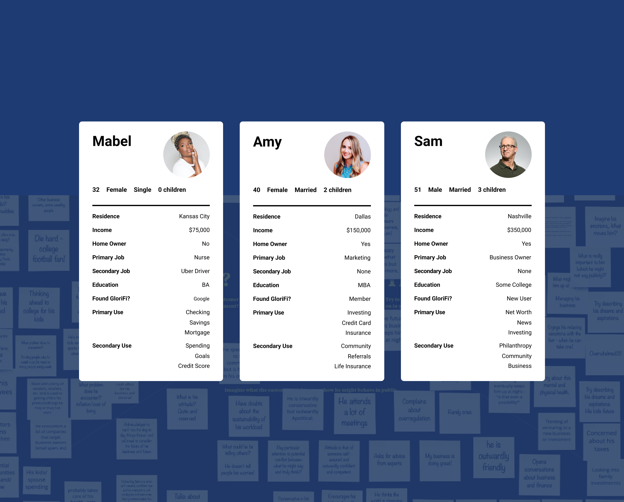
Workshops
Facilitated empathy‑mapping workshops to uncover user motivations and behaviors, informing personas that highlighted opportunity areas and guided experience improvements.
Information architecture
Mapped the core navigation, content hierarchy, and user flows to ensure the experience remained intuitive, predictable, and aligned with user mental models.
Wireframe flows
Created user flows and wireframes, examining the design process and identifying areas for improvement. We discussed potential issues and brainstormed solutions to ensure a seamless and user-friendly experience.
Visual design
UI exploration established the foundation for a scalable design system that unified typography, color, spacing, and component patterns across mobile and web.
UI exploration
Applied brand styles across early layouts and interaction patterns to establish a consistent visual direction. This work created the foundation for mockups that were both effective and aligned with our guidelines and design principles.
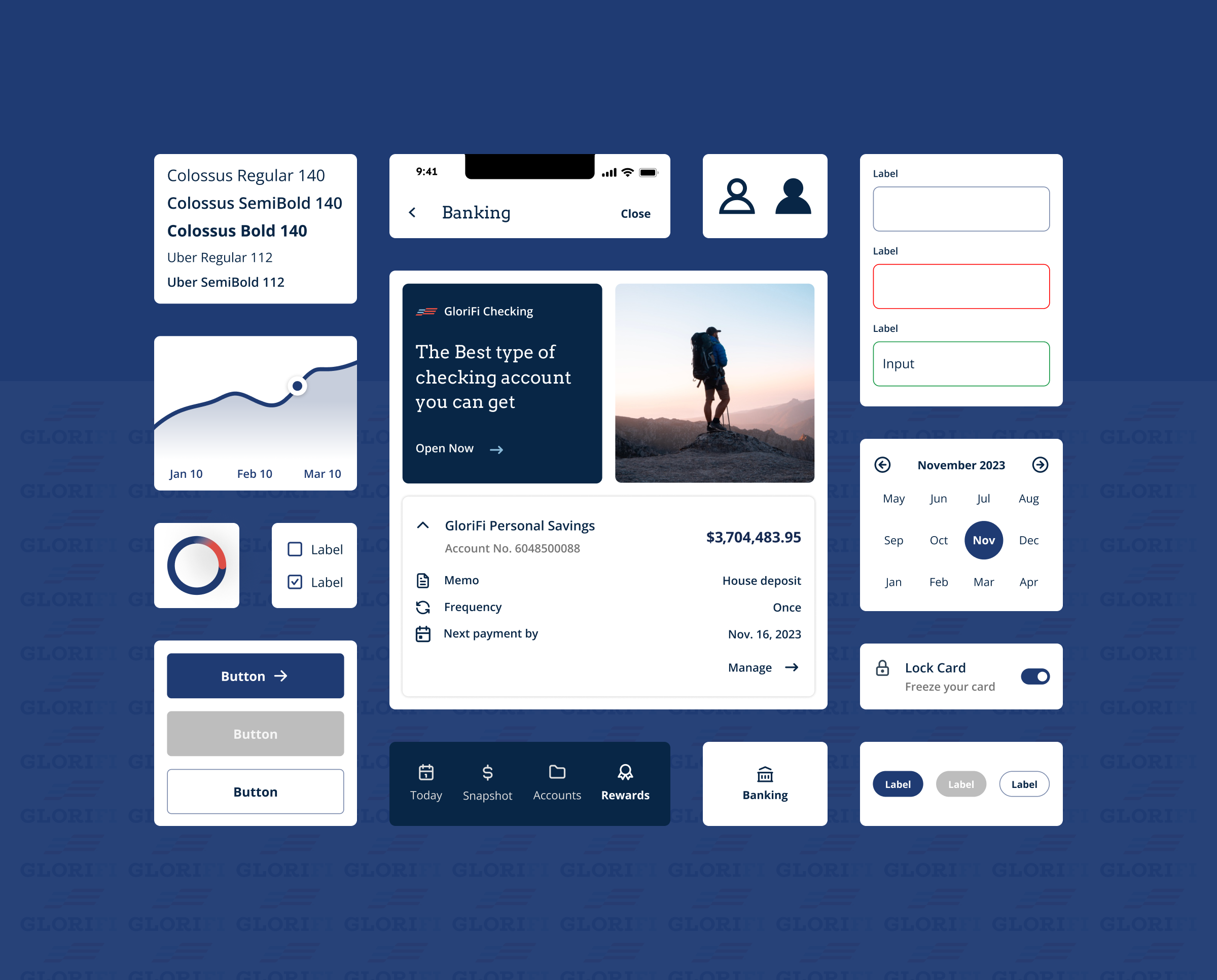
Design system
This UI framework saved time and effort for the team by providing pre-built components and promoting best UI practices. The framework also allowed for easier maintenance and updates without compromising the site's integrity.
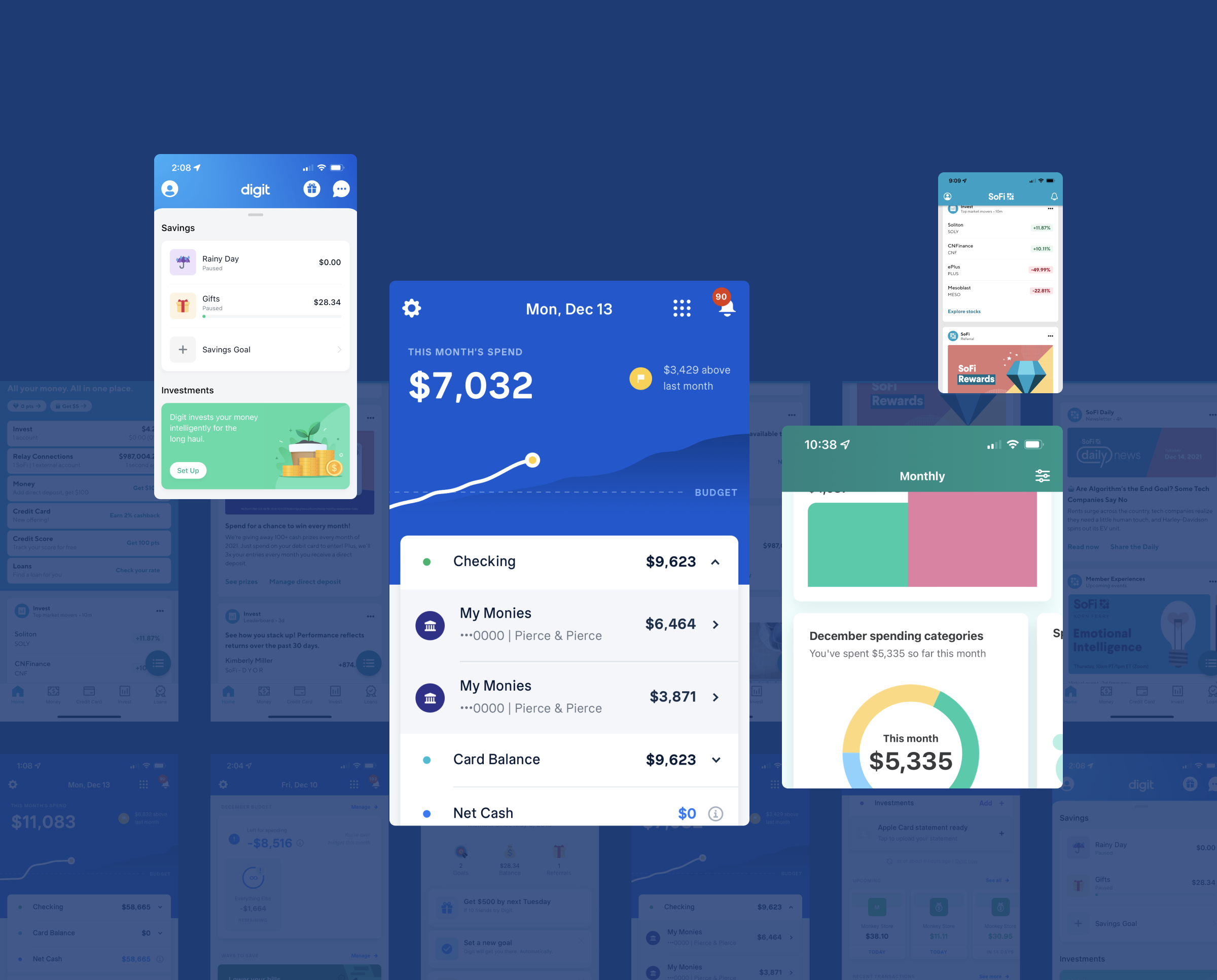
Product shipped
The final product delivered a cohesive financial experience that combined news, insights, rewards, and account management into a polished, user‑friendly interface.
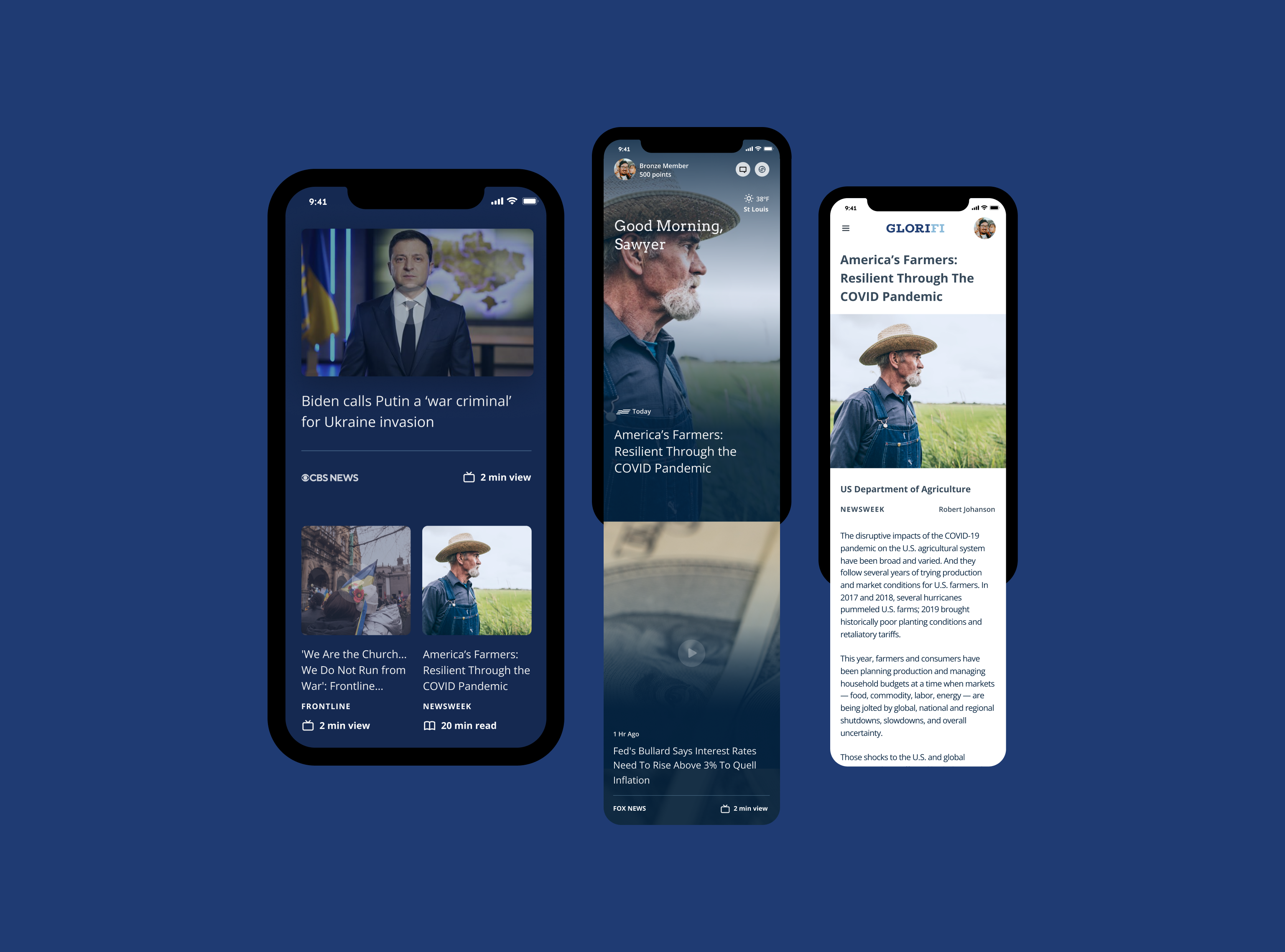
Today
This news feed presents global and financial news with a TikTok-style swipe interface. It's easy to browse and visually engaging for both casual readers and investors who want to stay informed.
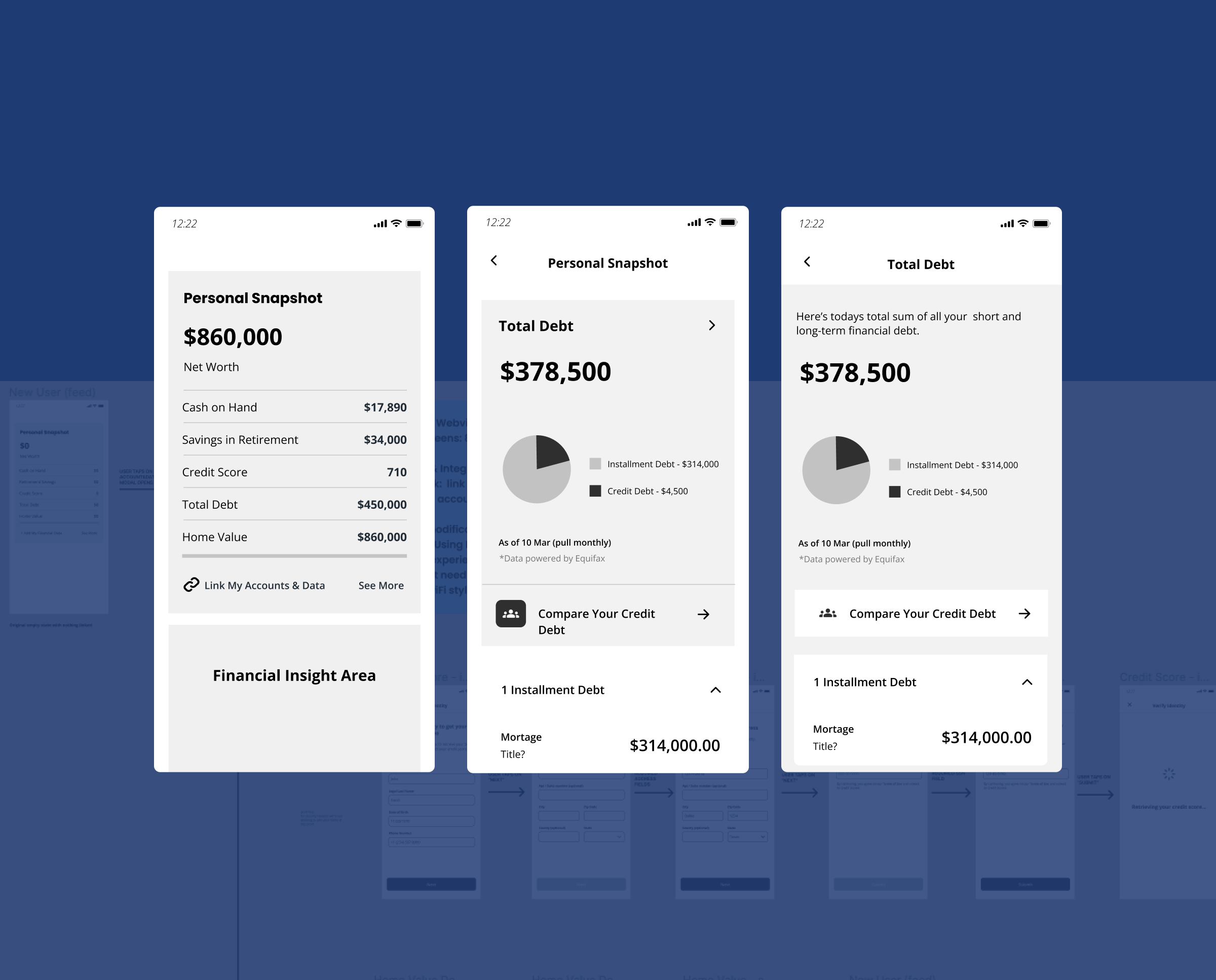
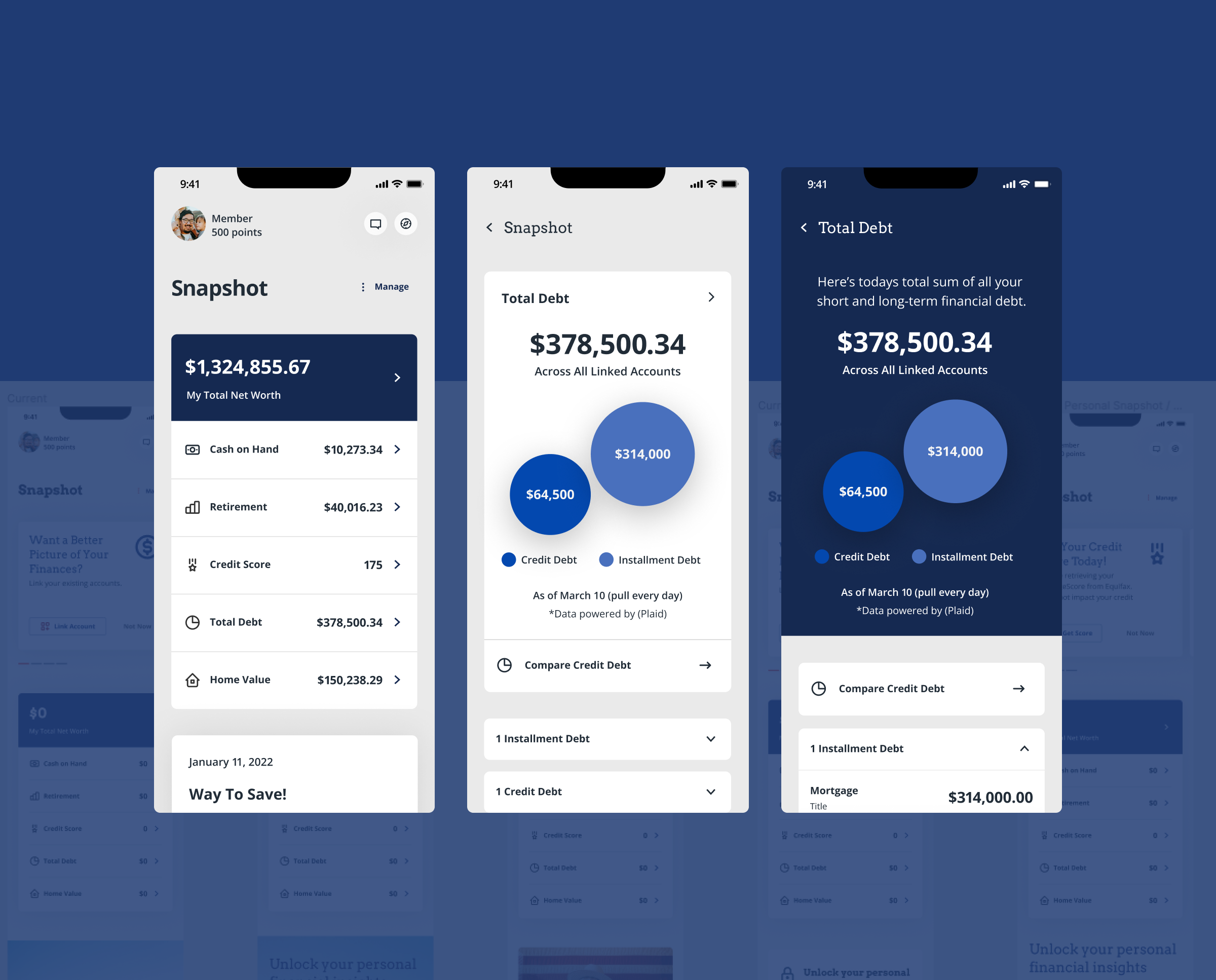
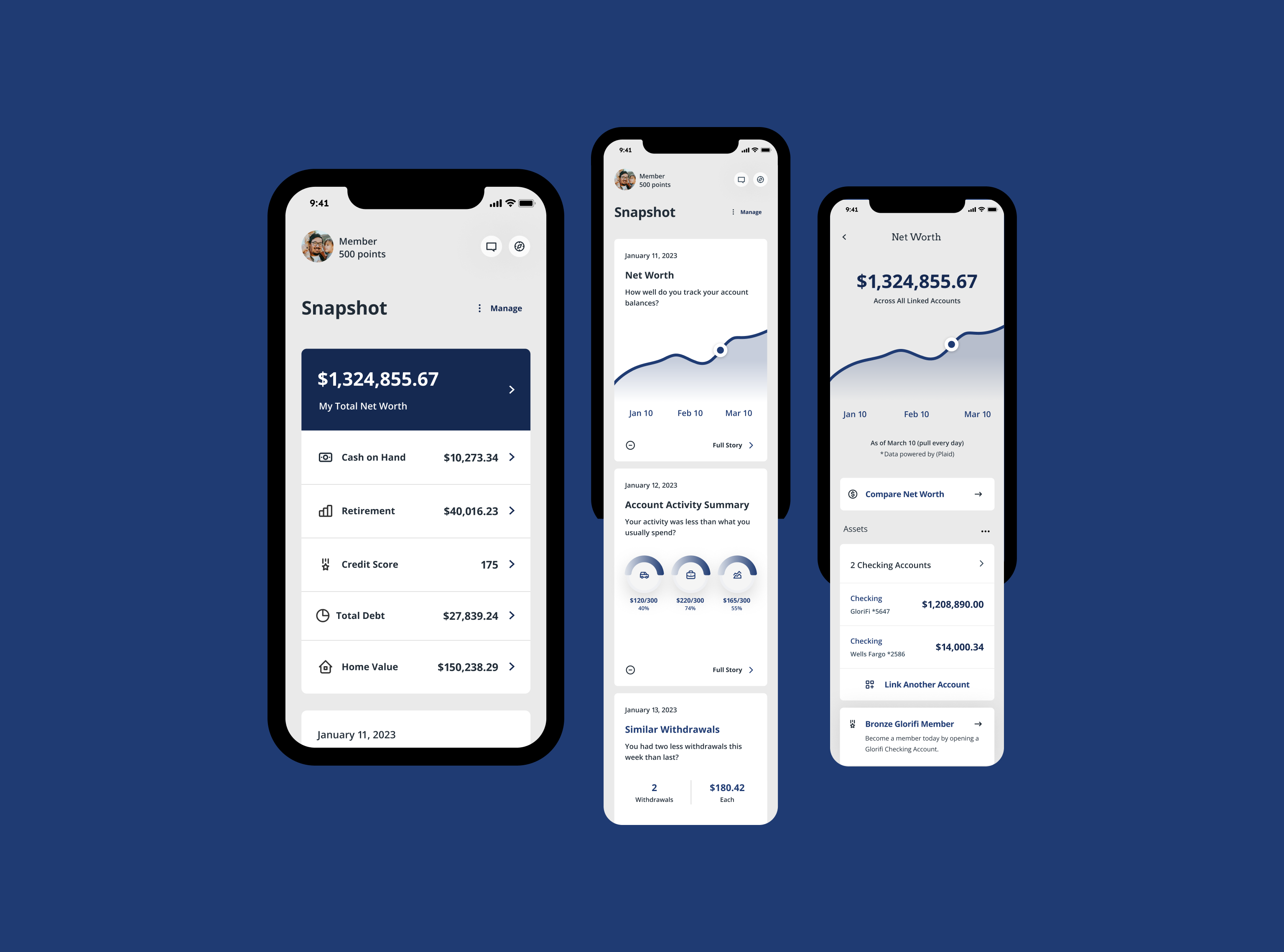
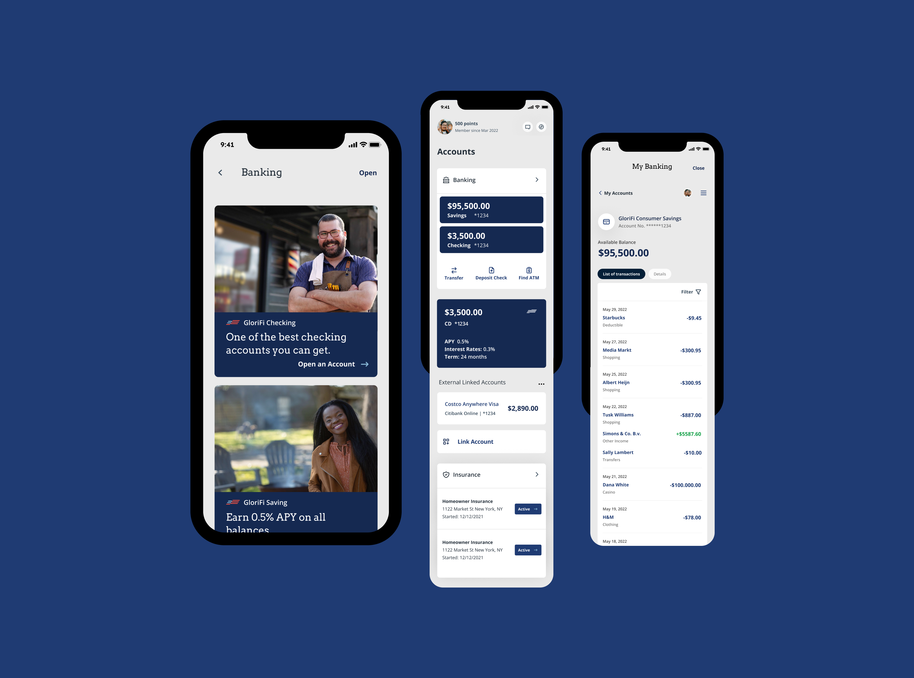
Snapshot
This dashboard helps you view income, expenses, investments, and debts. You can monitor progress, identify improvement areas, and make informed decisions.
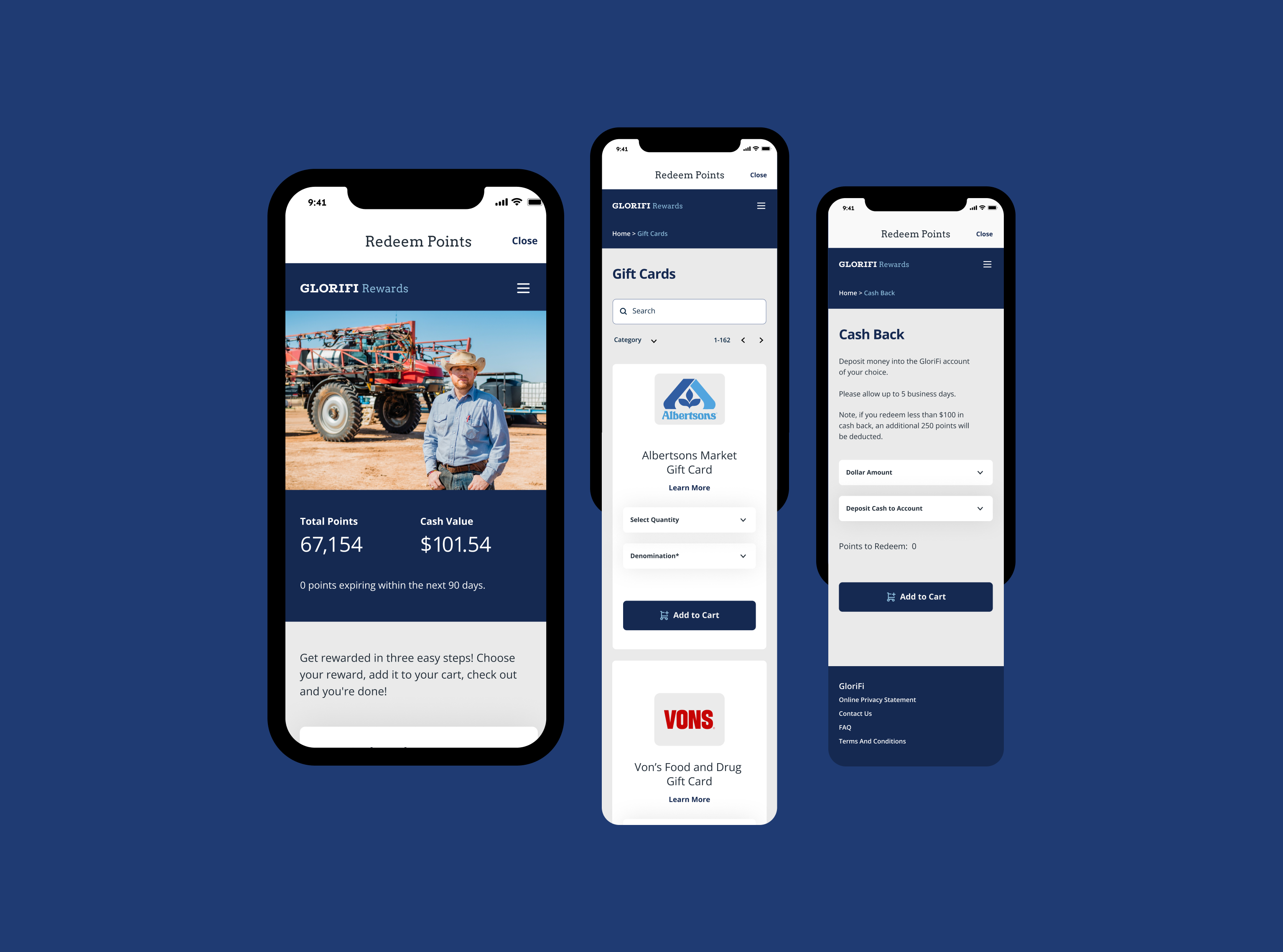
Rewards
Redesigned and reskinned the vendor loyalty feature so users get rewards and discounts from their favorite service providers.
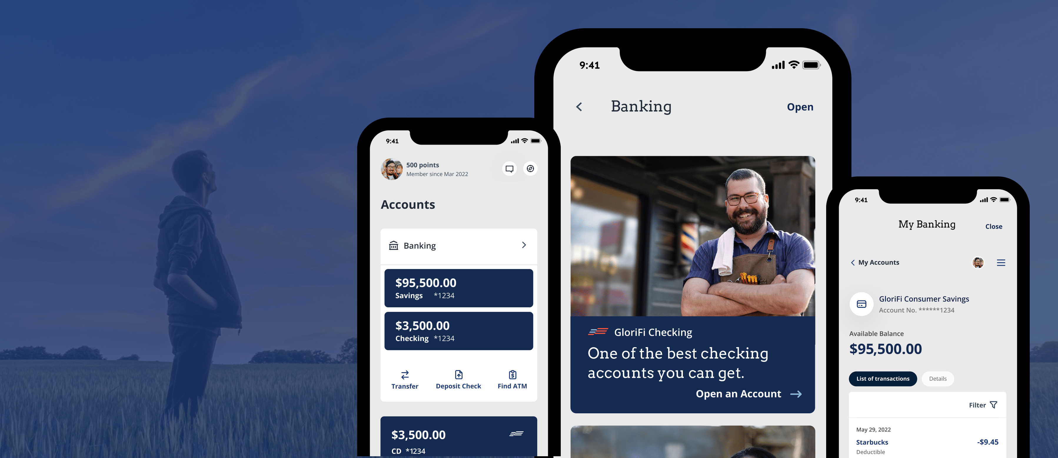
Accounts
Reusable marketing cards and user flow screens simplify banking account opening. This approach helps users select the right account and quickly complete the task.
Next project
ServSafe
Industry standard food safety training and certification platform strengthened through clearer learning flows, improved usability and more intuitive training experiences.
See Case Study