A research repository built to streamline discovery
The Microsoft Hits experience enhances research ingestion, improves navigation, and introduces a consistent visual system.
Situation
Microsoft's internal engineering teams relied on a legacy data intelligence repository that was throttled by rigid search structures and high workflow friction. The existing tool lacked a cohesive system foundation, severely limiting cross-organizational knowledge sharing and user visibility.
Task
As a Product Designer, my mandate was to architect a high-performance web platform that integrated corporate system standards to scale adoption. I owned the structural overhaul of the search patterns, complex data filtering interfaces, and the end-to-end user navigation layout.
Action
Conducted system audits, stakeholder interviews, and empathy mapping to isolate the core operational bottlenecks of the legacy layout. From these findings, I refactored the platform's information architecture and engineered a unified layout system that optimized the data-ingestion workflow.
Result
The redesigned repository significantly accelerated cross-functional knowledge discovery by giving technical teams greater control over complex data views. Post-launch qualitative evaluations confirmed a substantial lift in internal user satisfaction, directly driven by the cleaner, less obtrusive design framework.
Discovery
I conducted foundational research to understand how teams interacted with the legacy system, identifying friction points and opportunities for improvement.
System audit
To comply with the new design direction Microsoft Hits was audited to identify areas where changes could be made.
Workshops
To enhance our user experience, I engaged in empathy mapping workshops which gave me an immersive opportunity to gain a deeper understanding of our target audience.
Information architecture
I restructured the navigation and content hierarchy to reduce cognitive load and make key workflows easier to discover and complete.
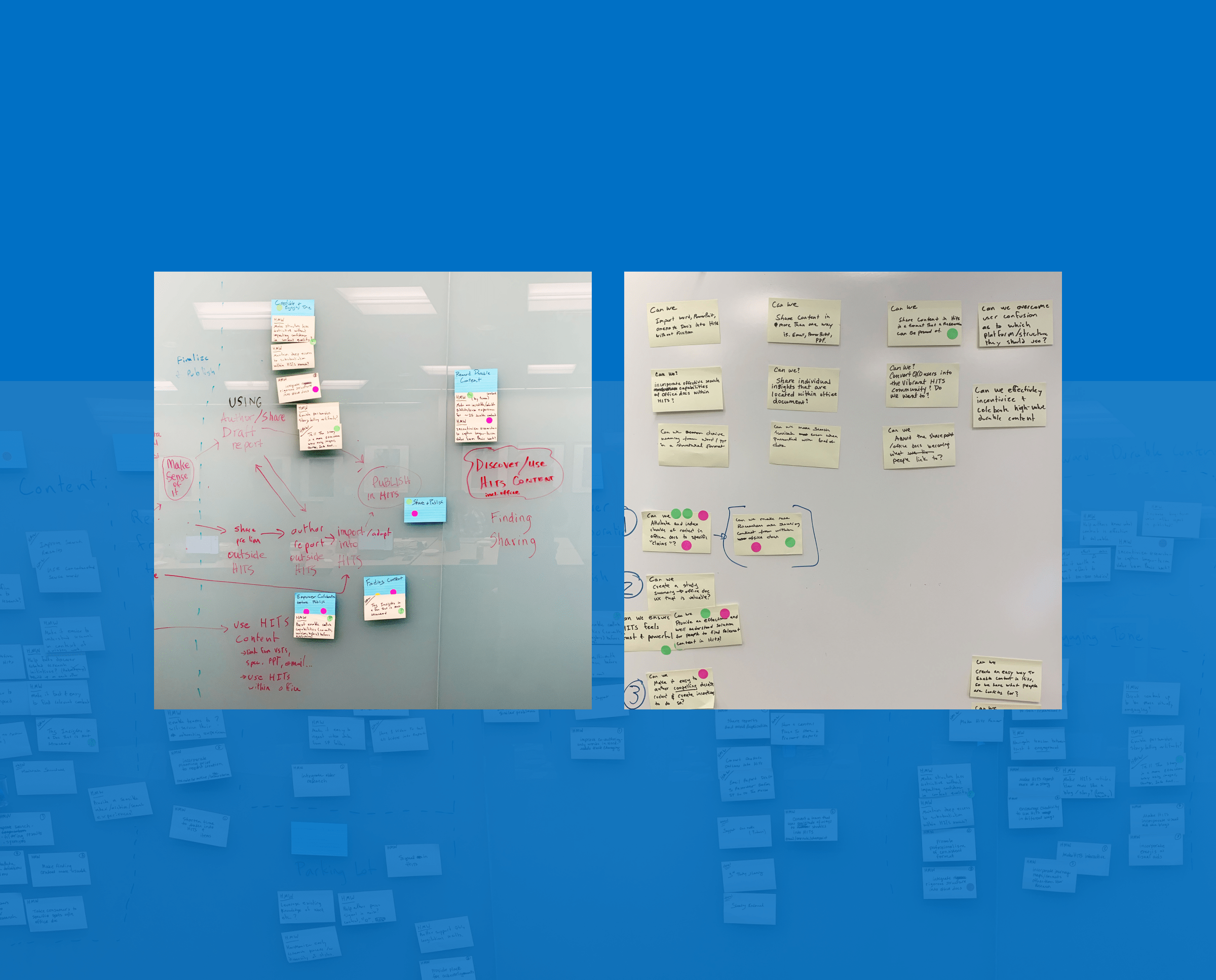
Wireframe flows
Collaborating with stakeholders, I created low to medium fidelity wireframes as a strategic tool to extract valuable insights and better understand the intricacies of the design goals.
Visual design
I applied Microsoft’s design principles to create a cleaner, more accessible interface that supports clarity, consistency, and long‑term scalability.
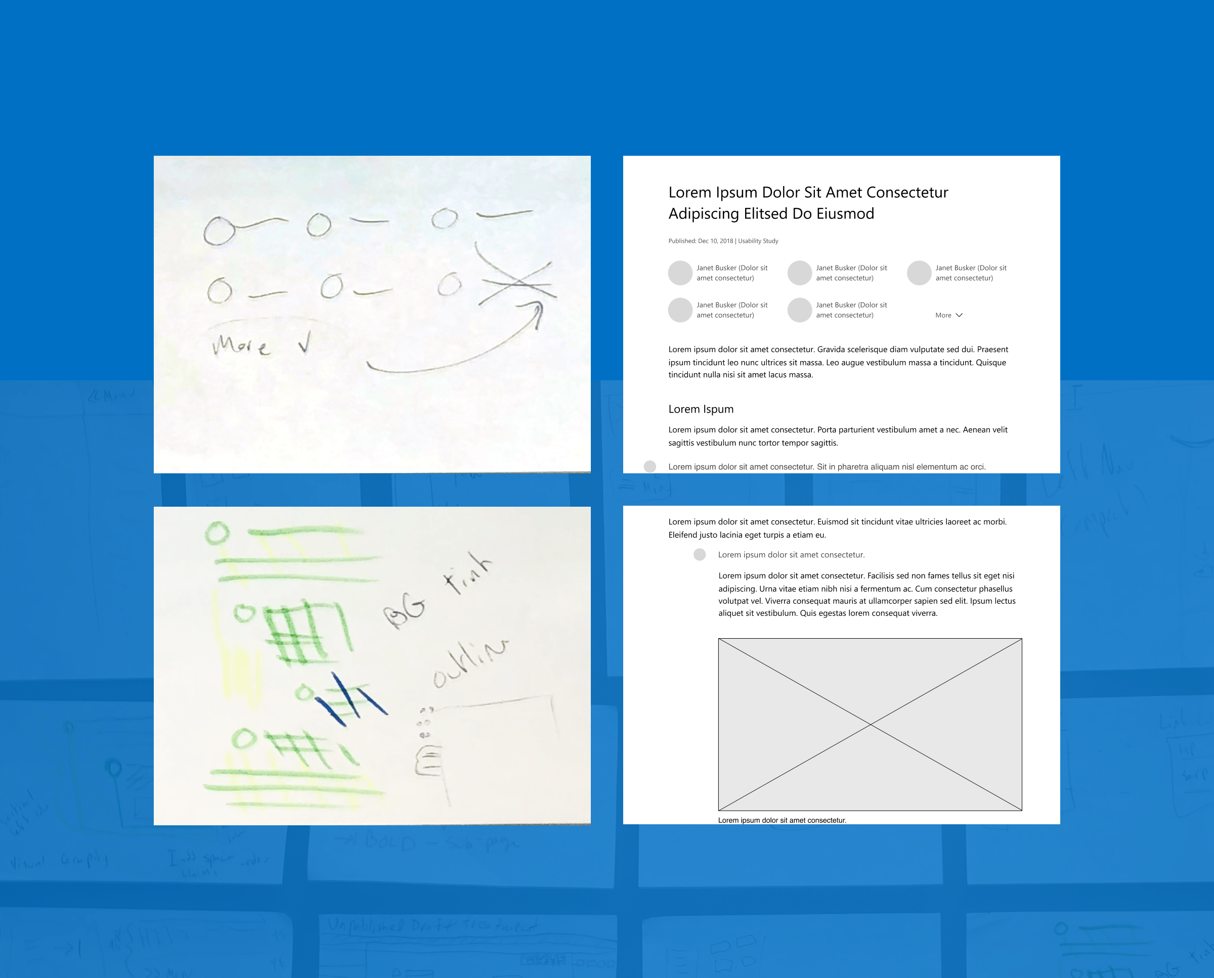
UI exploration
By considering every element of the wireframes and incorporating relevant design elements, I was able to ensure that the resulting mockups were both visually appealing and functional, bringing the wireframes to life and providing a clear representation of the final product.
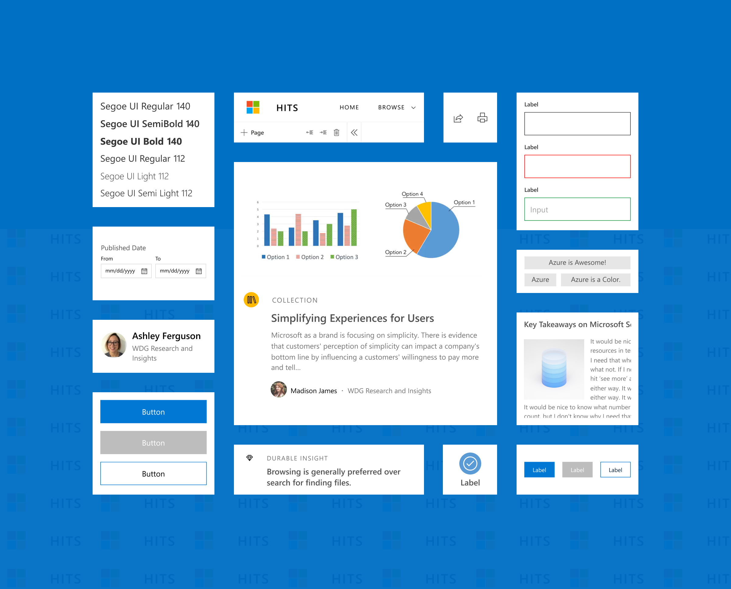
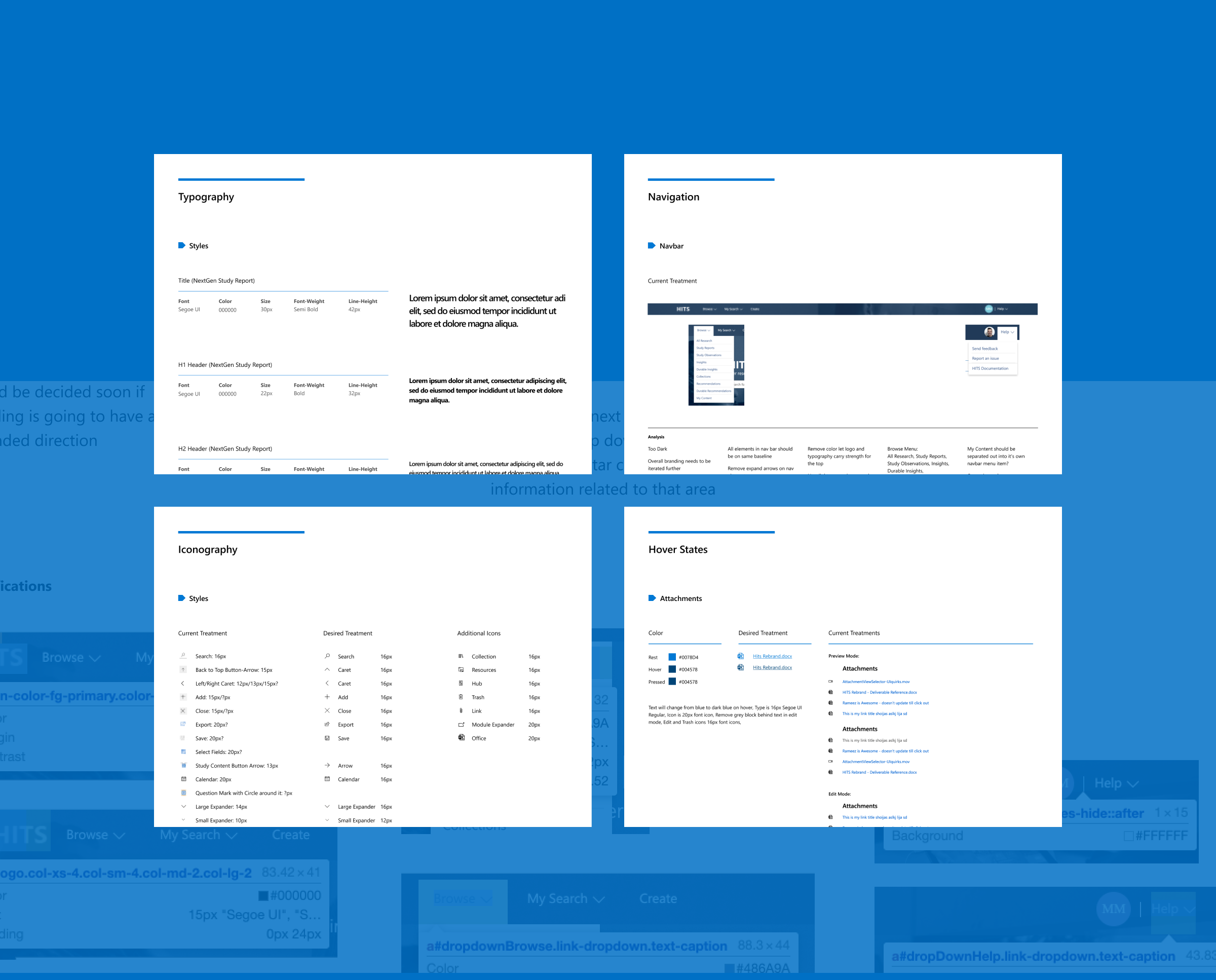
Design system
I crafted a series of reusable UI components that could be seamlessly integrated throughout the product design cycle so we could maintain a consistent and streamlined user experience.
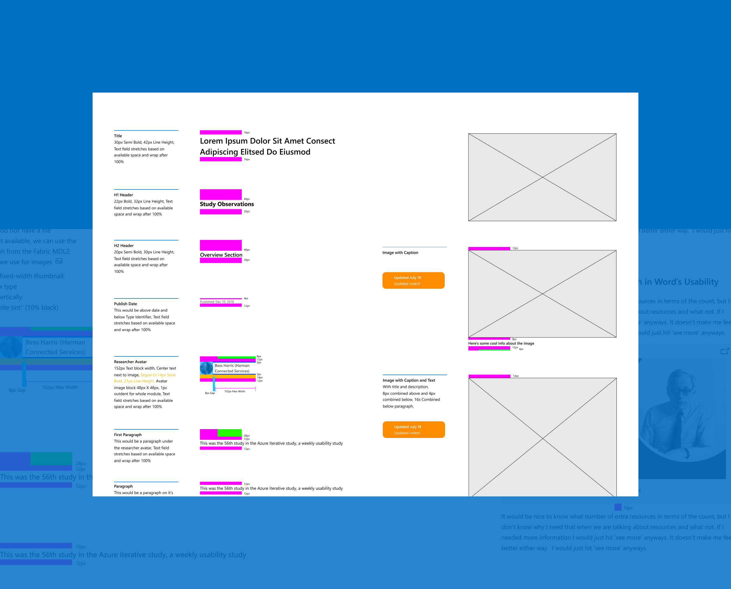
UI specs
To promote smooth and efficient teamwork during the implementation of the design system we decided to use Redline documentation as a way of communicating important information about the structure and functionality of all components.
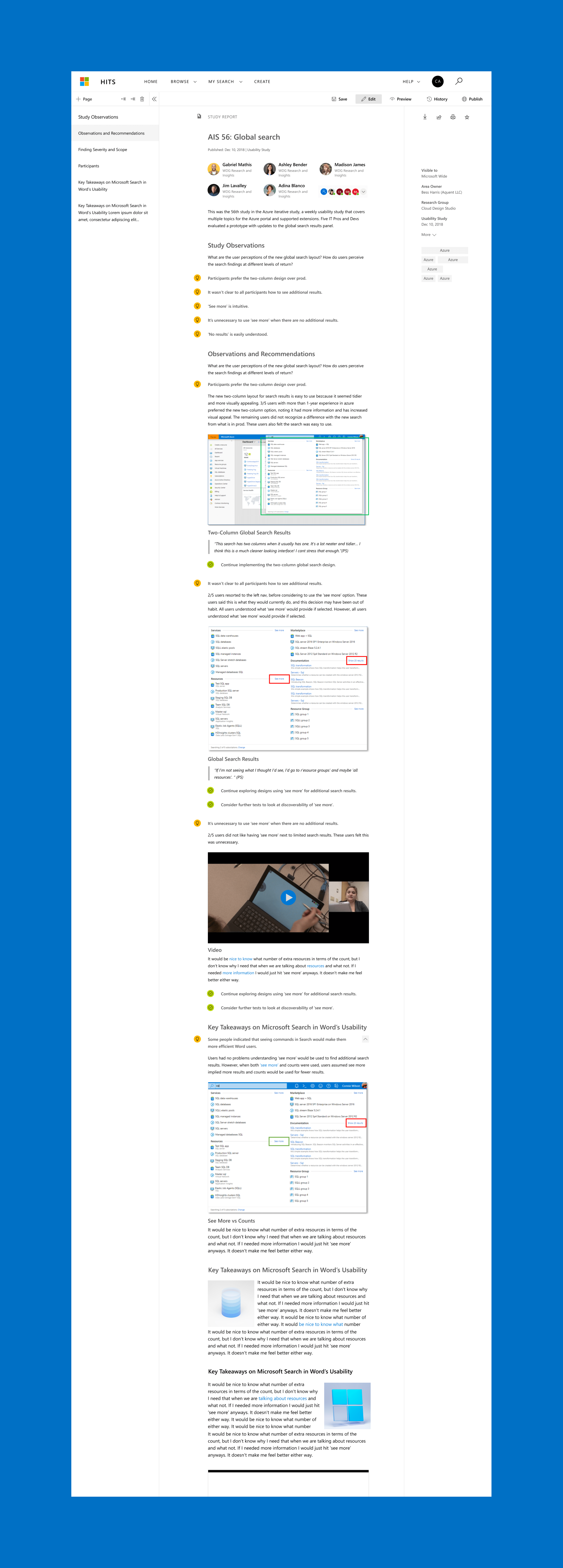
Product shipped
The final release delivered a modernized research platform that improved usability, reduced friction, and enabled teams to work more efficiently.
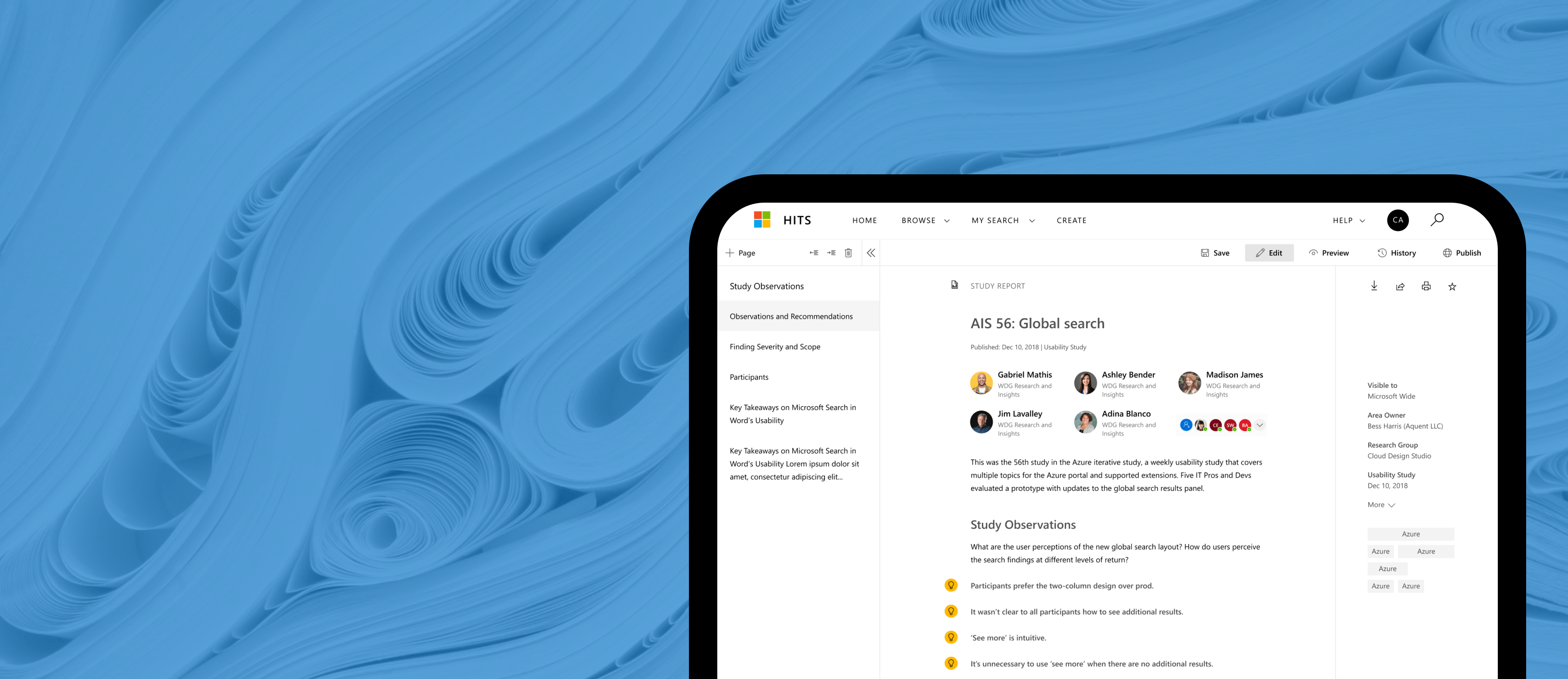
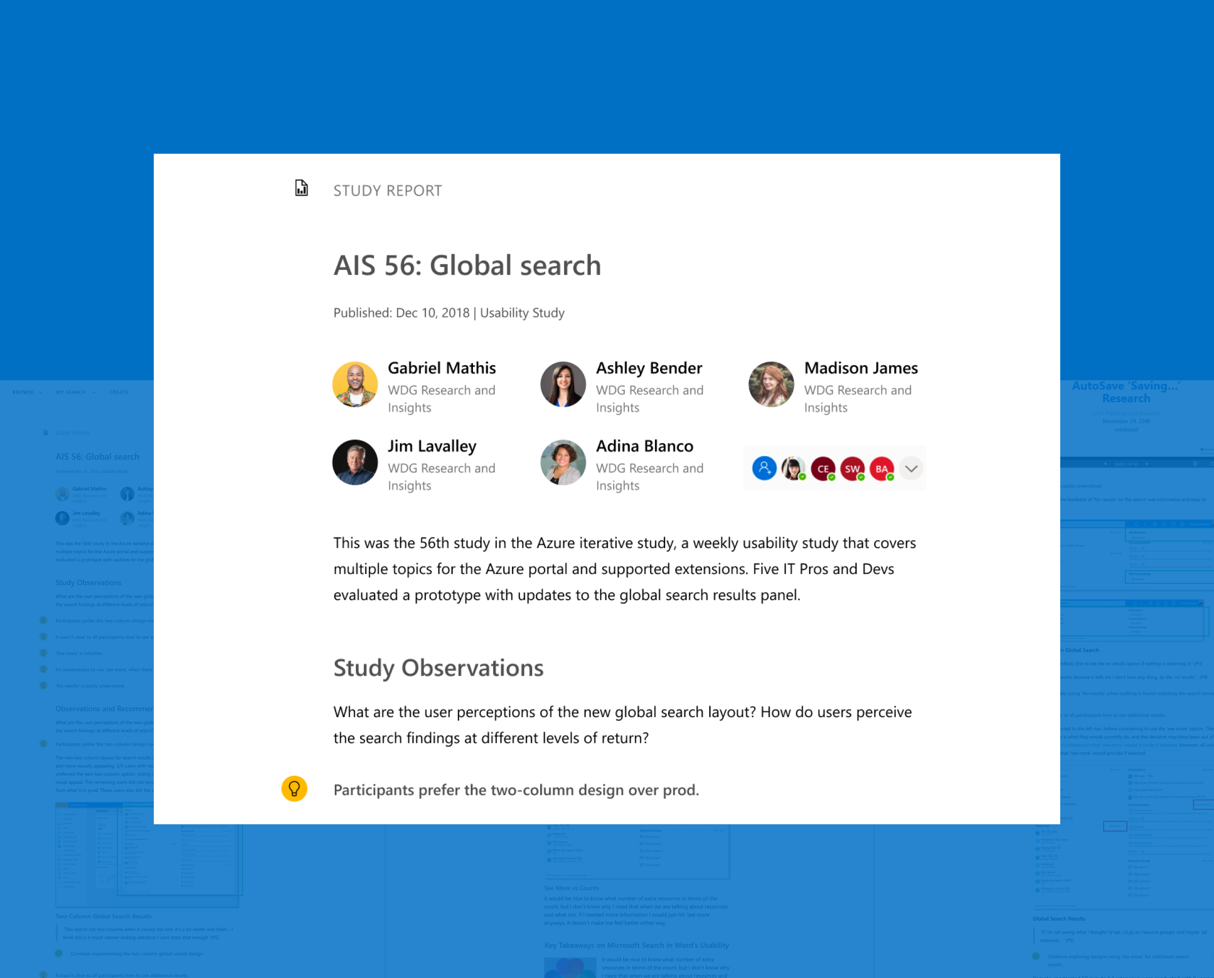
Content ingestion editor
This customizable tool facilitates the ingestion, editing, and collaborative management of UX research content for Microsoft, providing valuable insights and data to the organization.
Next project

Eddie Bauer
Ecommerce experience design for product pages, interaction patterns, and design‑system to create a cohesive and effective shopping journey.
See Case Study