A unified system for modern nutrition solutions
Nutrilucent integrates product systems, brand identity, and digital experience through clear structure and thoughtful design.
Situation
Nutrilucent needed to launch an emerging digital wellness brand from the ground up, requiring a cohesive product narrative and system design to anchor its ecosystem. The primary challenge was establishing core interface patterns and visual trust for early users before scaling the product line.
Task
As a Product Designer, my mandate was to establish the comprehensive interface direction, brand foundations, and design system patterns. I owned the user experience strategy, translation of health metrics, and layout guidelines for the digital touchpoints.
Action
Executed user discovery research, stakeholder interviews, and competitive audits to align user needs with business priorities. From these insights, I engineered the high-contrast typography system, modular telemetry grid layouts, and physical packaging concepts.
Result
The foundational design system accelerated product iteration speeds and established a highly credible web presence. The unified experience drove a measurable increase in early digital user engagement and supported successful sales performance for the product launch.
Discovery
Conducted research to understand user needs for the wellness landscape. These insights shaped the foundation for Nutrilucent’s emerging identity.
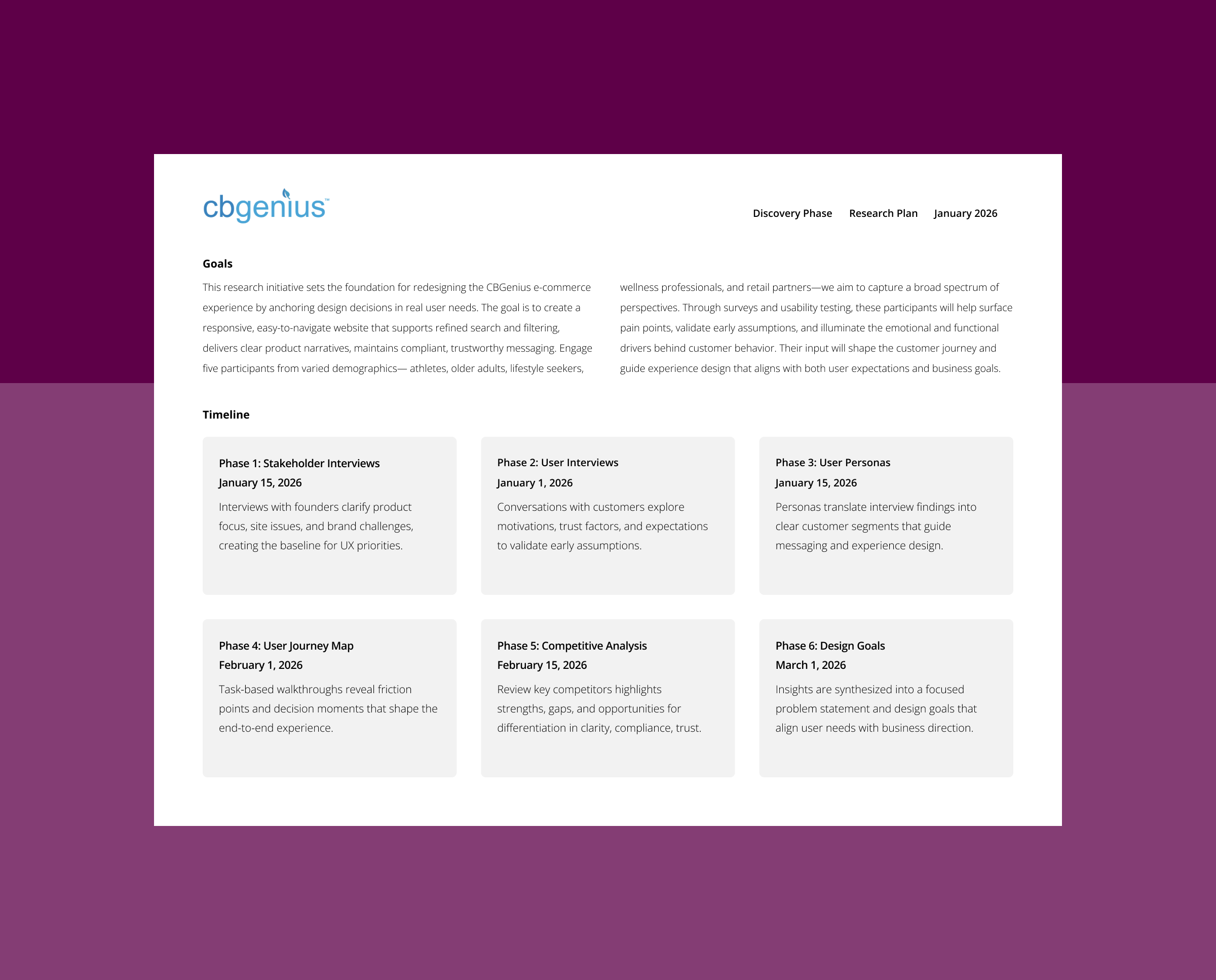
Research plan
Outlined a focused discovery process grounding the CBGenius to Nutrilucent design migration in real user needs. Through interviews, personas, journey mapping, competitive analysis, and design goals, it builds a clear foundation for aligning the experience with business priorities.
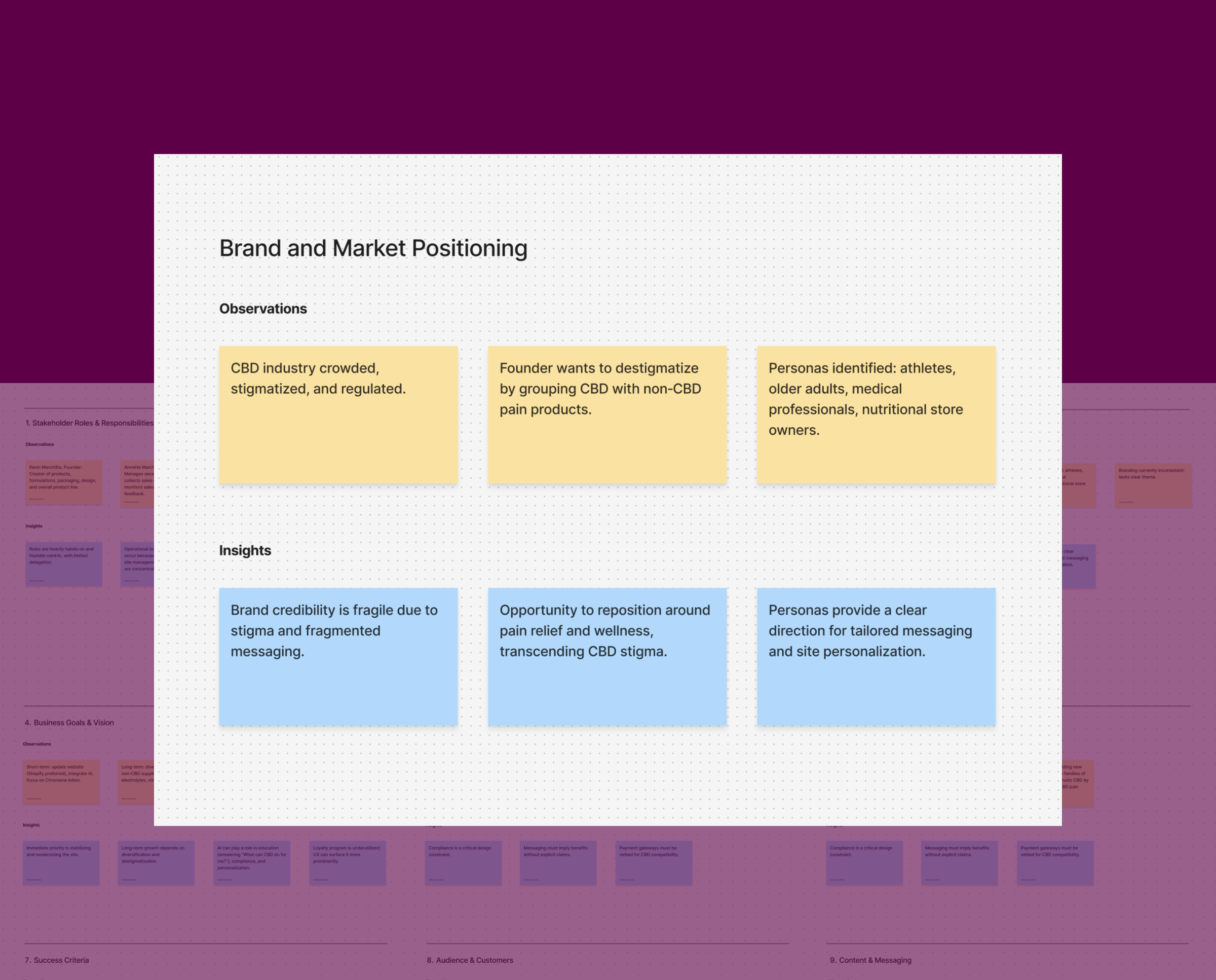
Stakeholder interview
Clarified core business goals, target audiences, and the strategic challenges shaping the design. Surfaced priorities around modernizing the site, integrating AI support, strengthening credibility, and positioning Nutrilucent as the hero product, creating a clear baseline for UX direction.
Insights matrix
Synthesized patterns across roles, product strategy, brand, operations, and customer behavior. The work revealed founder‑driven workflows, a scattered product line, compliance‑sensitive messaging, and weak marketing foundations. The insights clarify where the business must focus to stabilize operations and strengthen the brand.
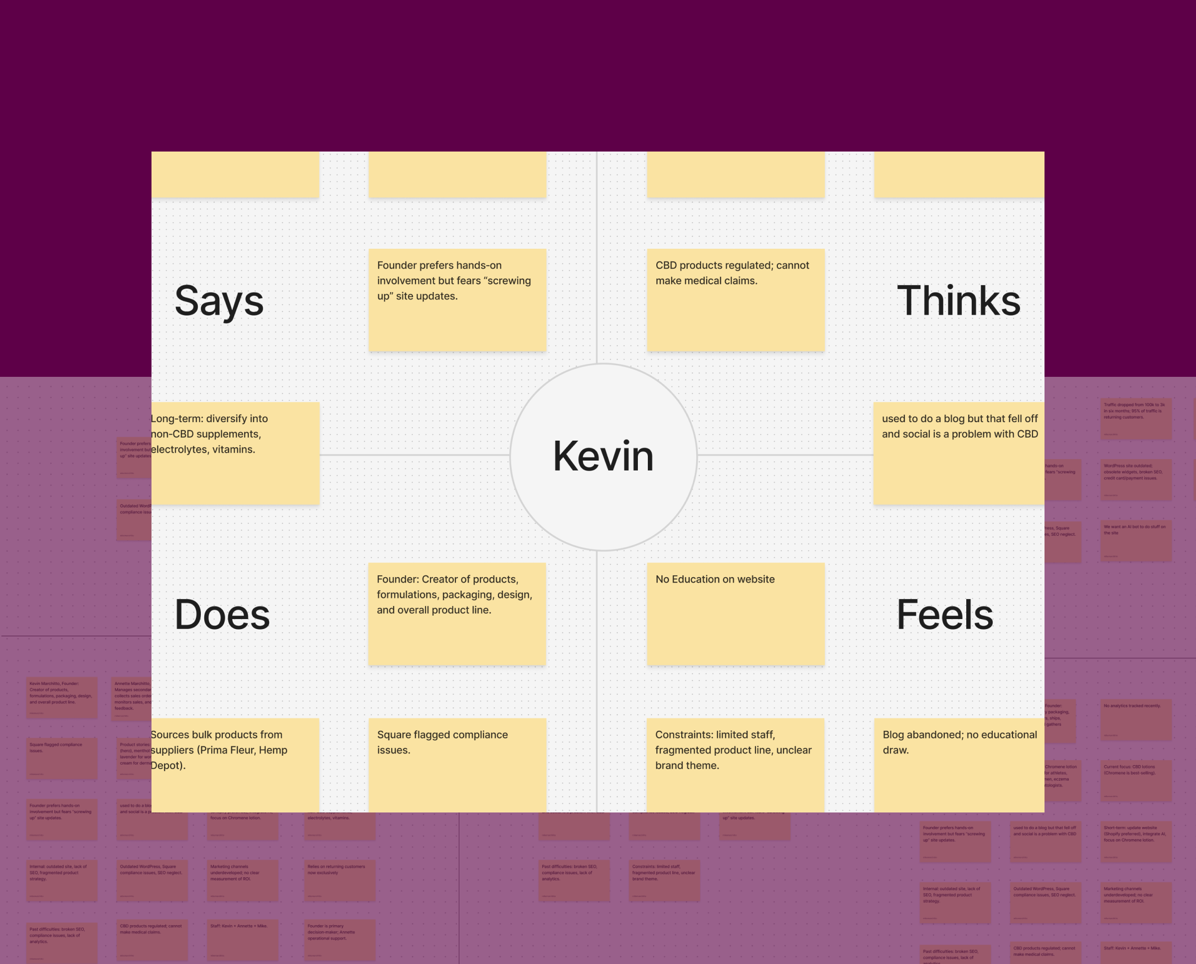
Empathy map
The founder is weighed down by an outdated site, compliance issues, and limited resources. Thinking about regulatory constraints and the need for education. Acts through hands on but inconsistent marketing and operations. Feels anxious about technical debt and unclear branding, pointing to the need for a simpler platform and clearer direction.
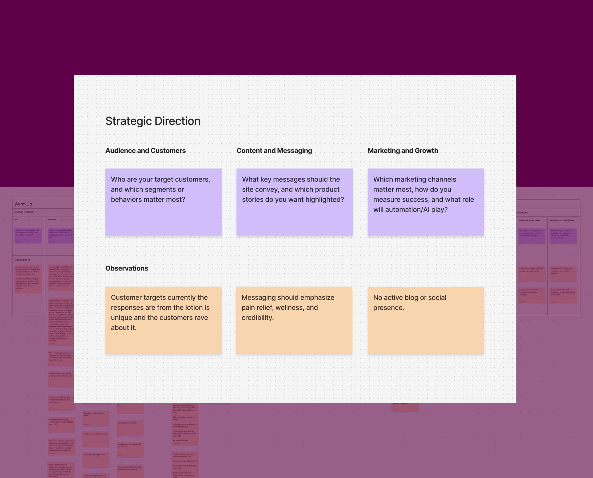
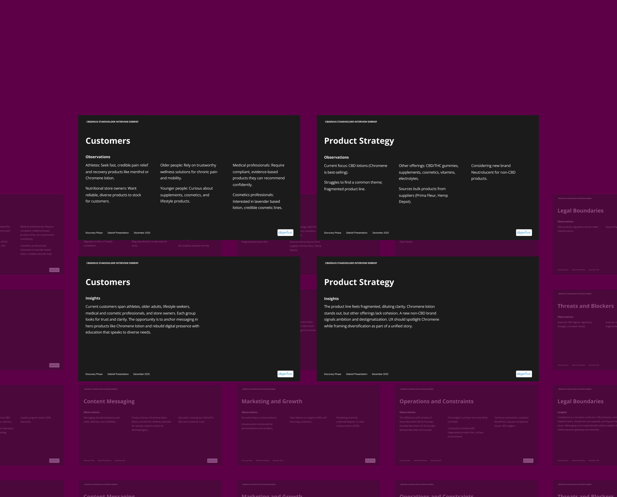
Stakeholder interview debrief
Consolidated the findings into a clear narrative of the business direction. Emphasized the priorities ahead by modernizing the digital experience, elevating Chromene, clarifying the Nutrilucent brand, and preparing for expansion beyond CBD. These are the strategic drivers for the next phase of work.
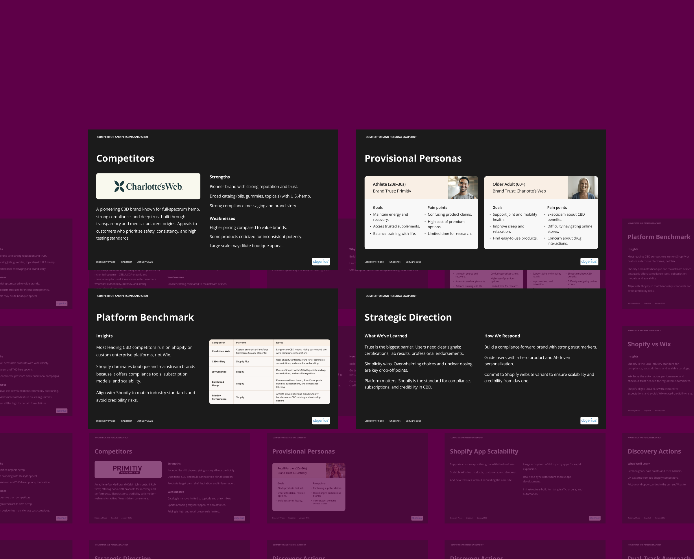
Snapshot
Distilled competitive, persona, and platform research across the CBD space to understand how trust, simplicity, and compliance shape user behavior. Studying leading brands, provisional personas, and industry benchmarks revealed UX opportunities around trust signals, guided product selection, and scalable e-commerce foundations that informed the project’s direction.
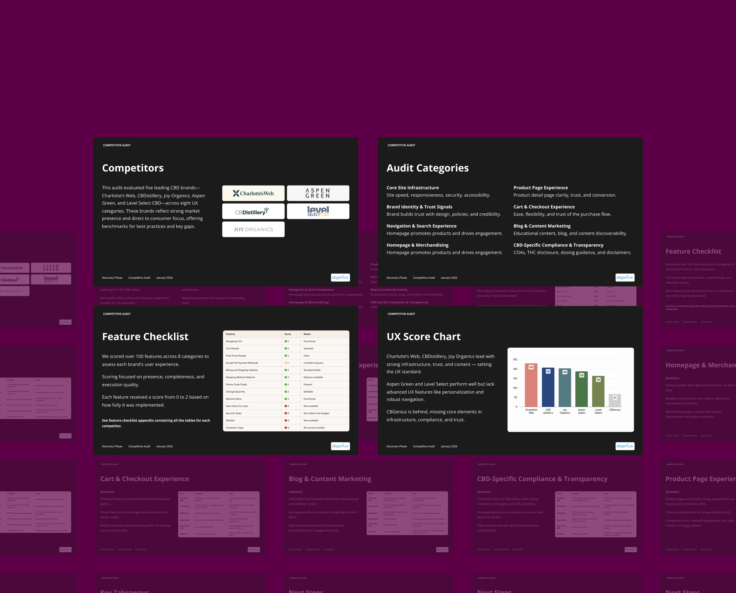
Competitive audit
A deeper dive evaluating five leading CBD brands across key UX categories to identify strengths and gaps. Scoring 100+ features revealed consistent weaknesses in accessibility, personalization, trust signals, and compliance, highlighting clear opportunities to differentiate and guide Nutrilucent’s UX direction.
Branding
The Nutrilucent brand system is in an active development phase, establishing a modern, credible, and scalable identity that can extend seamlessly across every touchpoint.
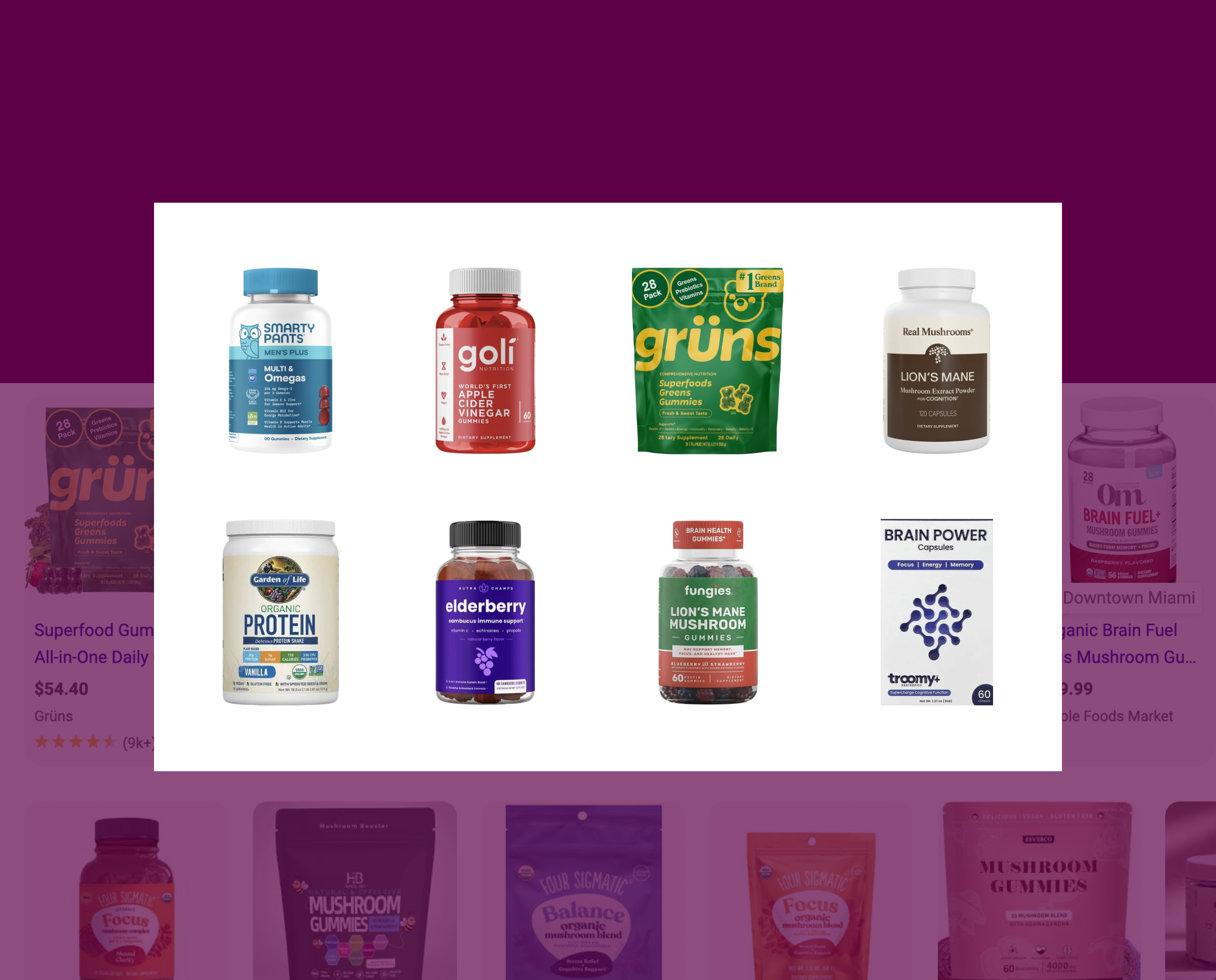
Brand audit
I reviewed leading wellness and supplement brands to understand how they communicate value and build trust. This revealed visual patterns, credibility cues, and opportunities for stronger differentiation.
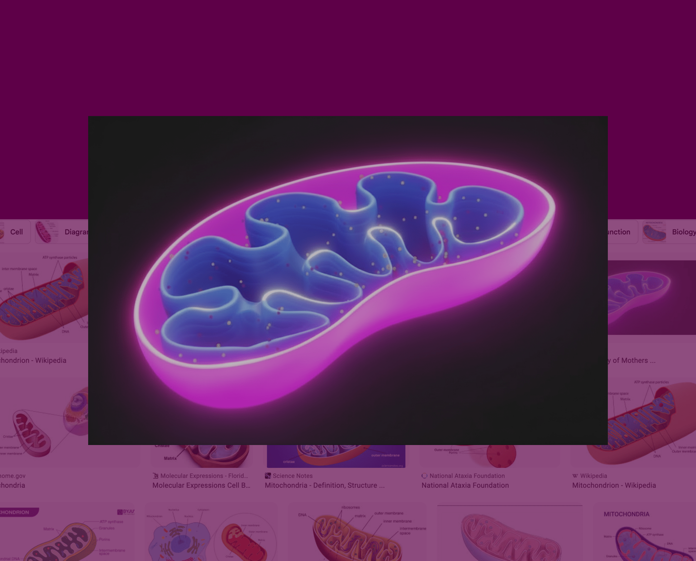
Inspiration
I explored visual themes from science, wellness, and technology to shape a brand language that feels energetic, intelligent, and future-focused. This illustration represents the inner structure of a mitochondrion, reflecting one of the core wellness benefits of Nutrilucent gummies.
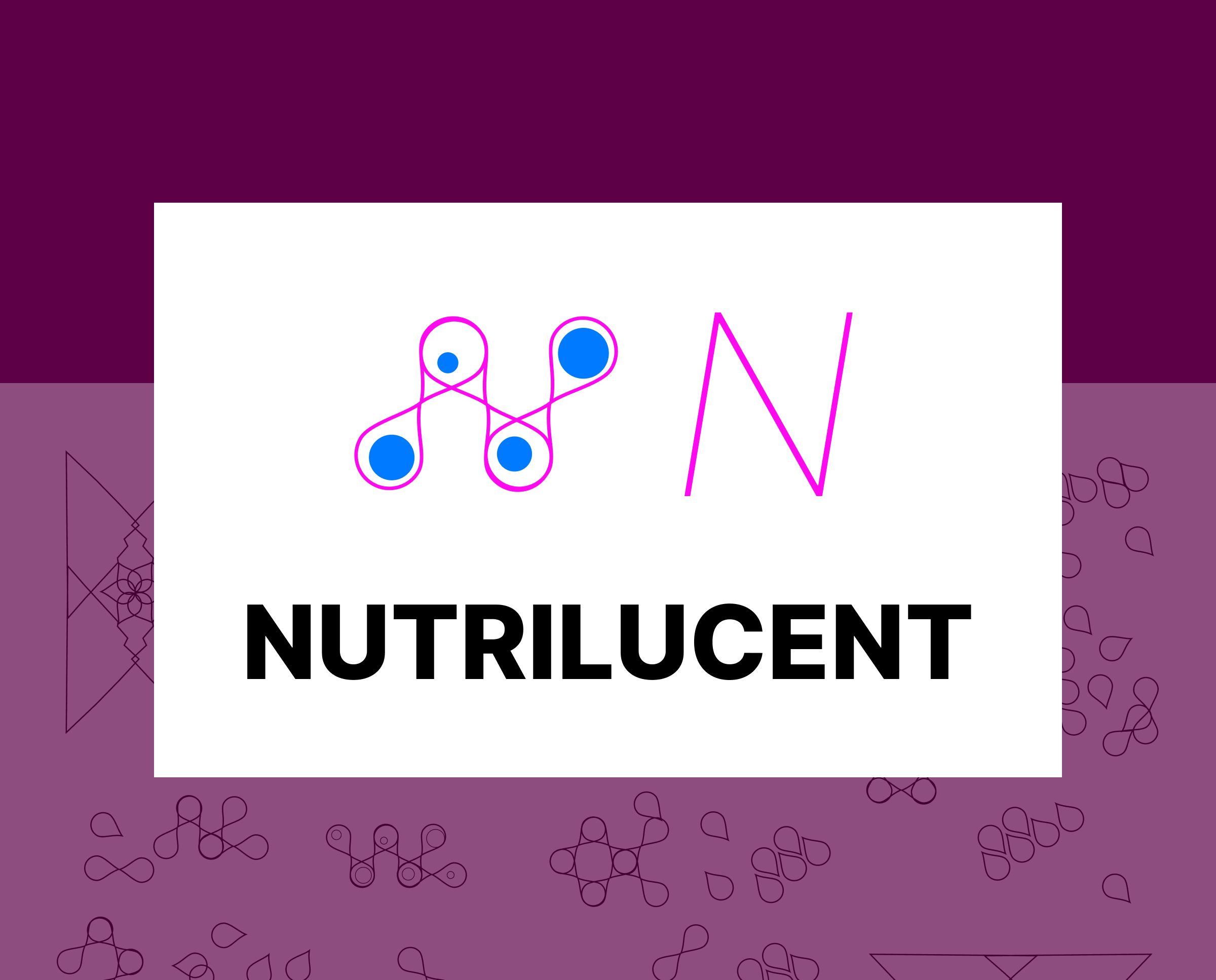
Sketching
Early sketches translate ideas of energy and cellular vitality into structural motifs that will shape the visual direction of the Mark and Logotype moving forward.
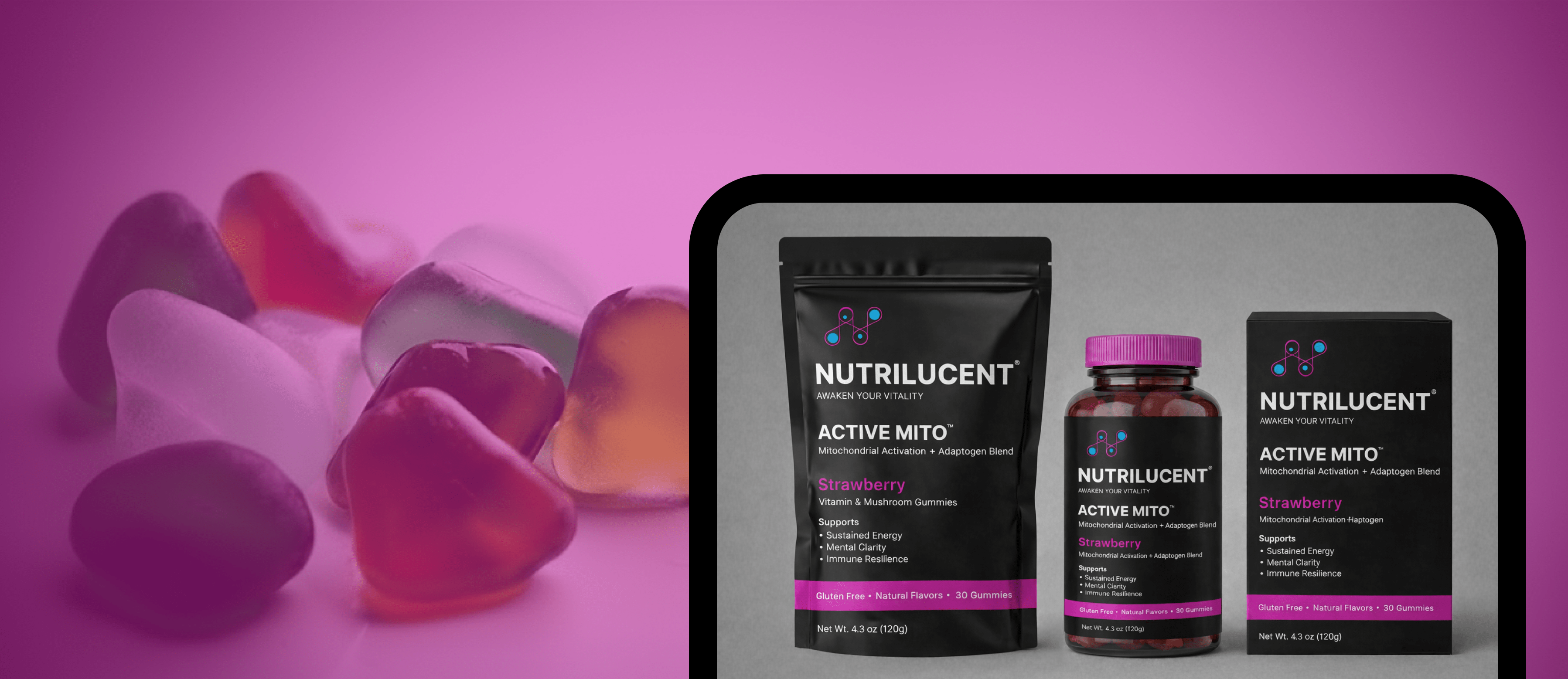
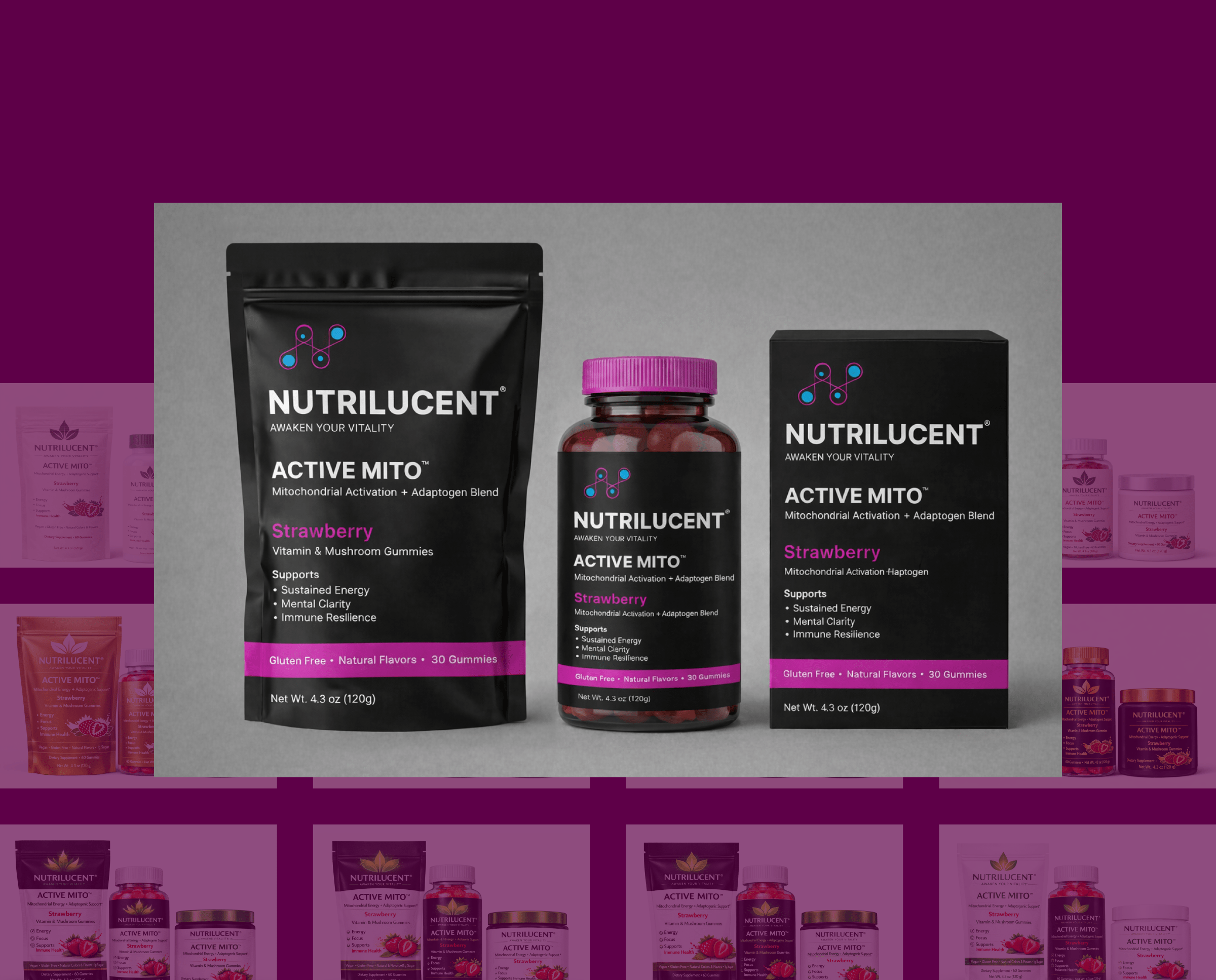
Packaging
This packaging concept emphasizes clarity and trust through strong hierarchy, bold color, and clear benefit communication. It scales easily across product lines while maintaining a unified brand presence.
Next project

Microsoft Hits
Research repository platform designed to make it easier for teams to access, share, and reuse insights through clearer navigation, consistent structure, and improved usability.
See Case Study